Breakazine! Rebranding
BREAKAZINE is a Hong Kong cultural magazine, started from 2009, that the target audience is middle school students. As it’s influence on the society is getting bigger, meanwhile, it is published from bimonthly turn into quarterly, they hope we can help them to upgrade their brand through re-branding.
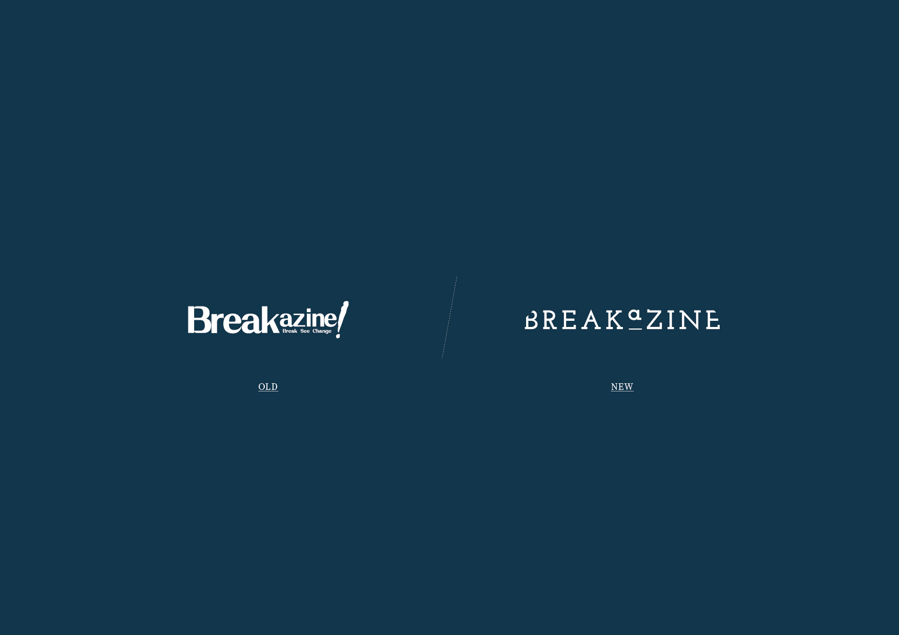
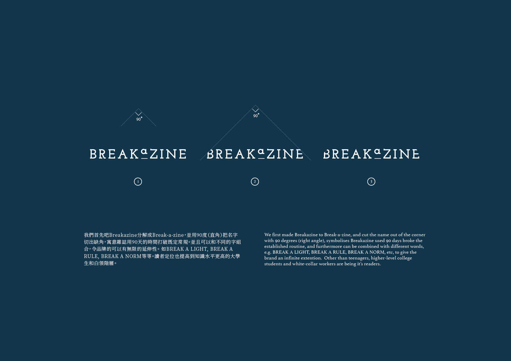
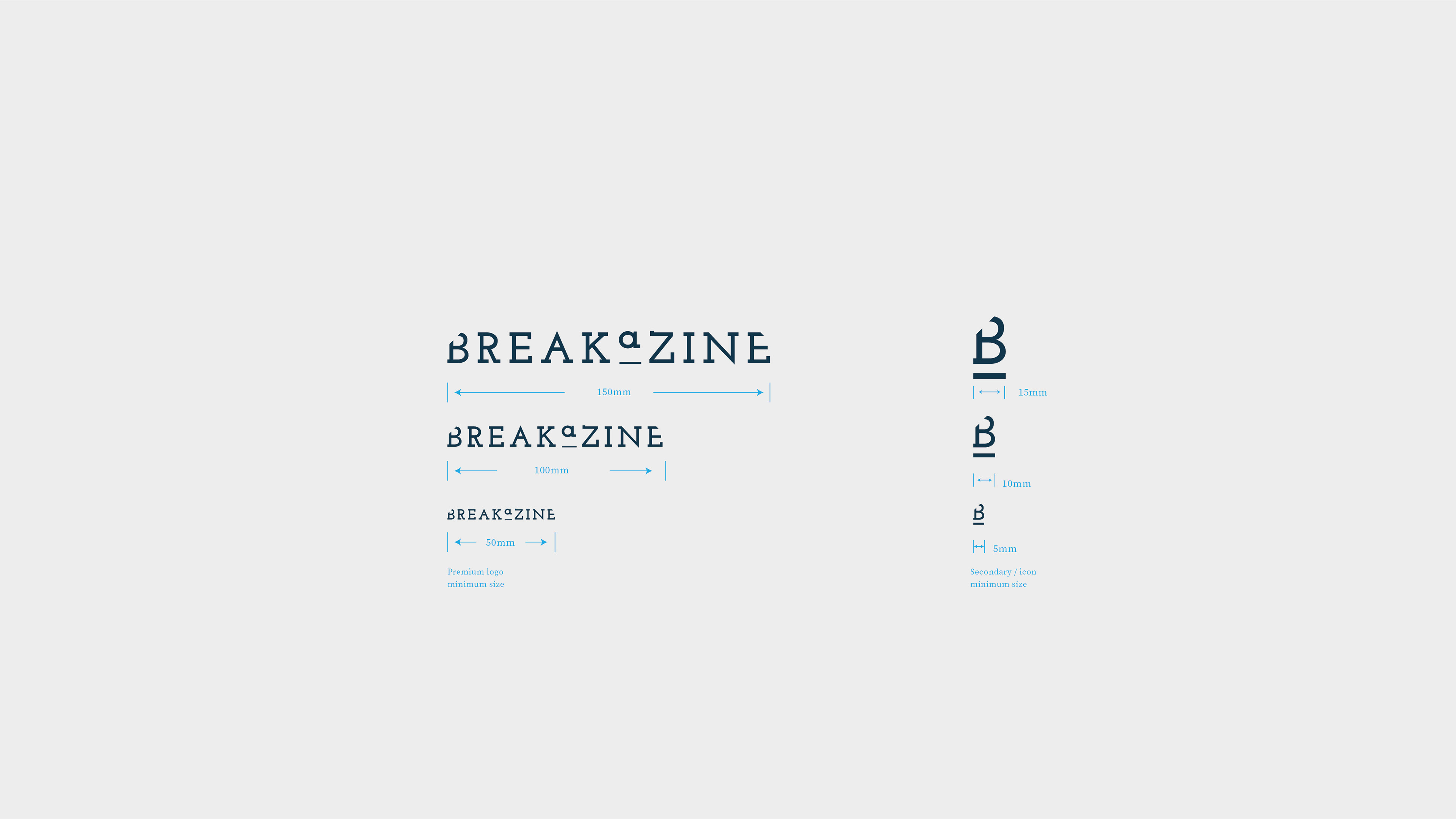
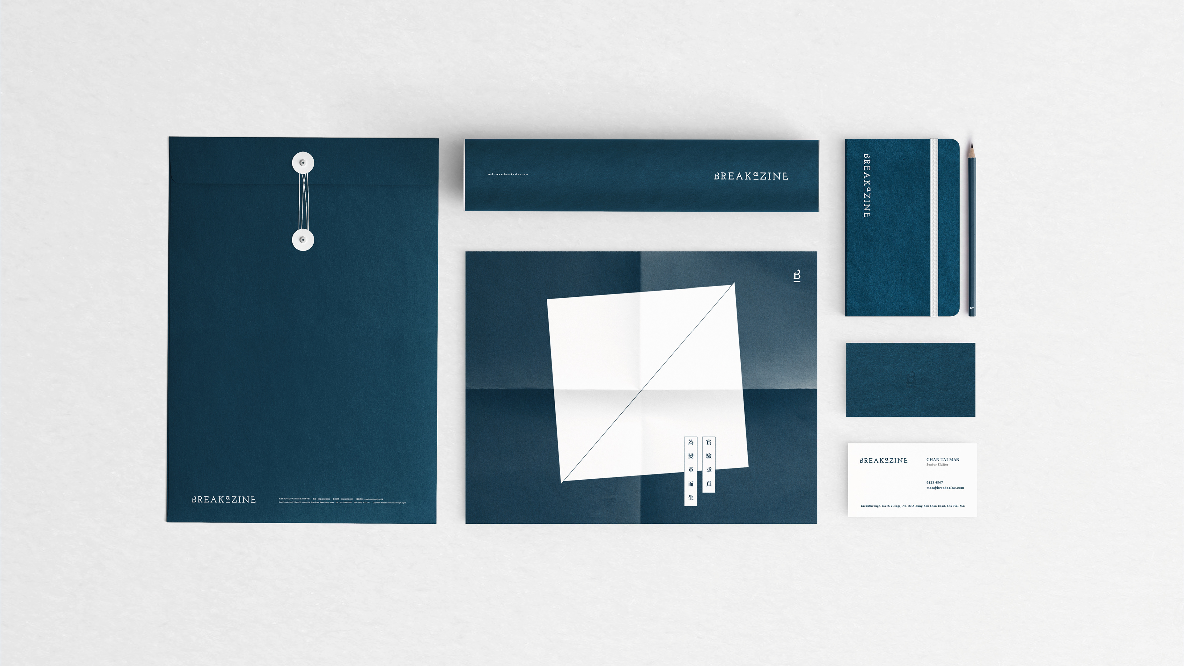
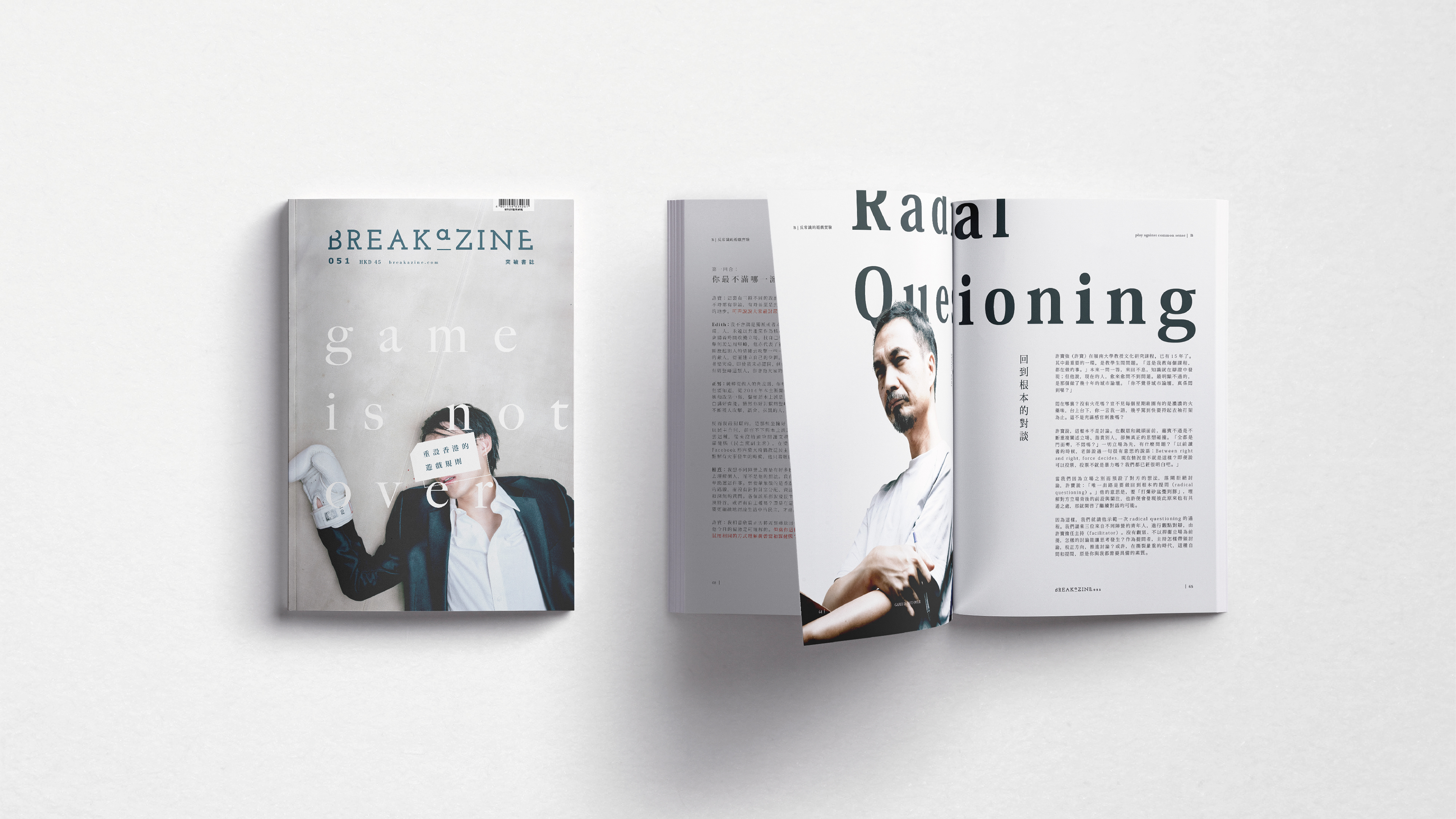
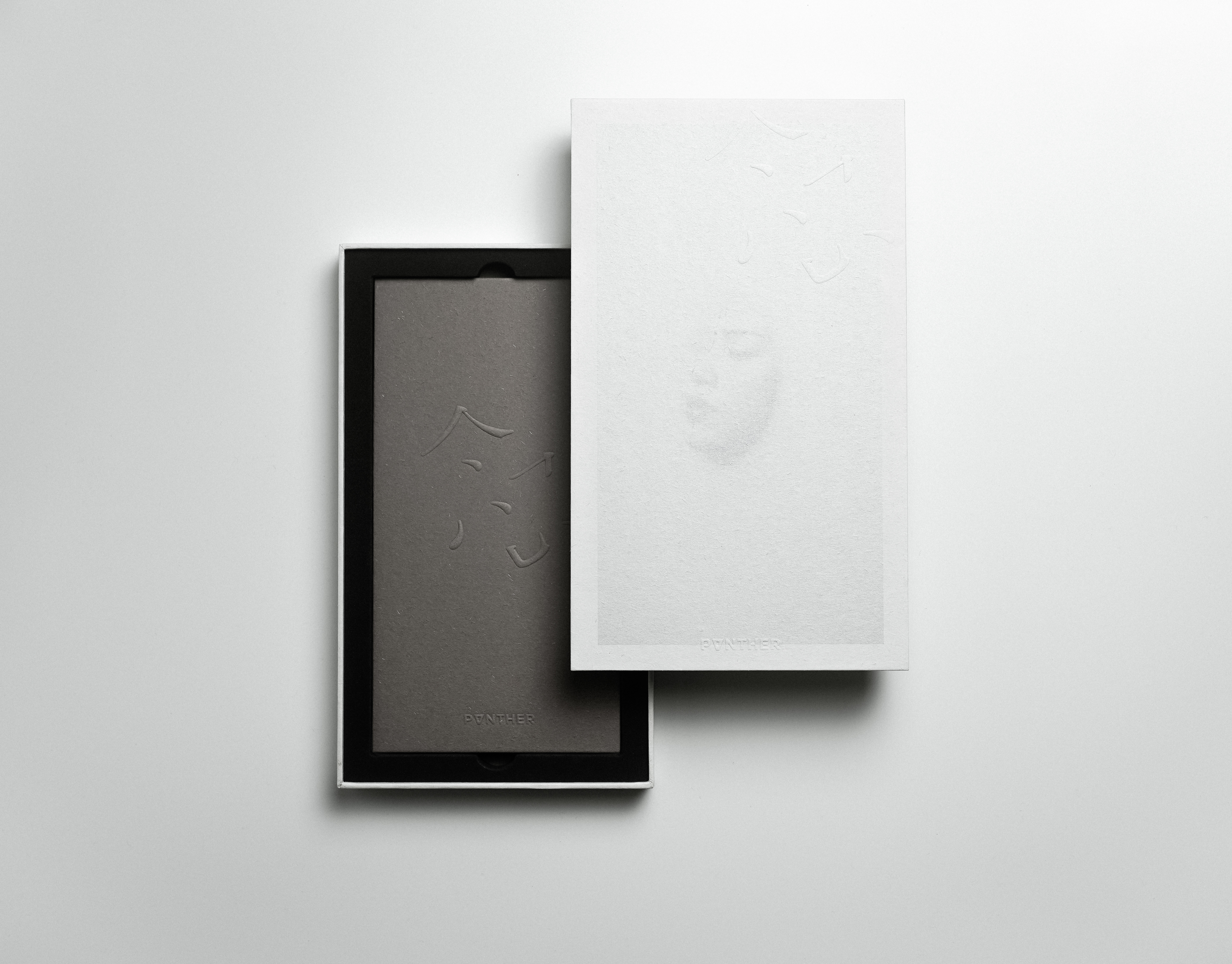
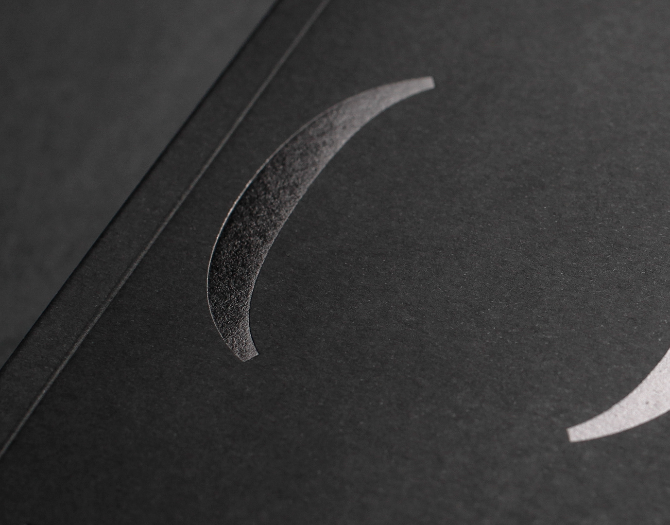
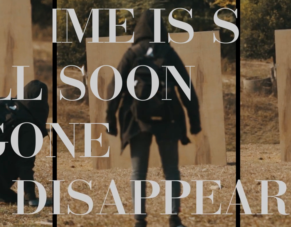
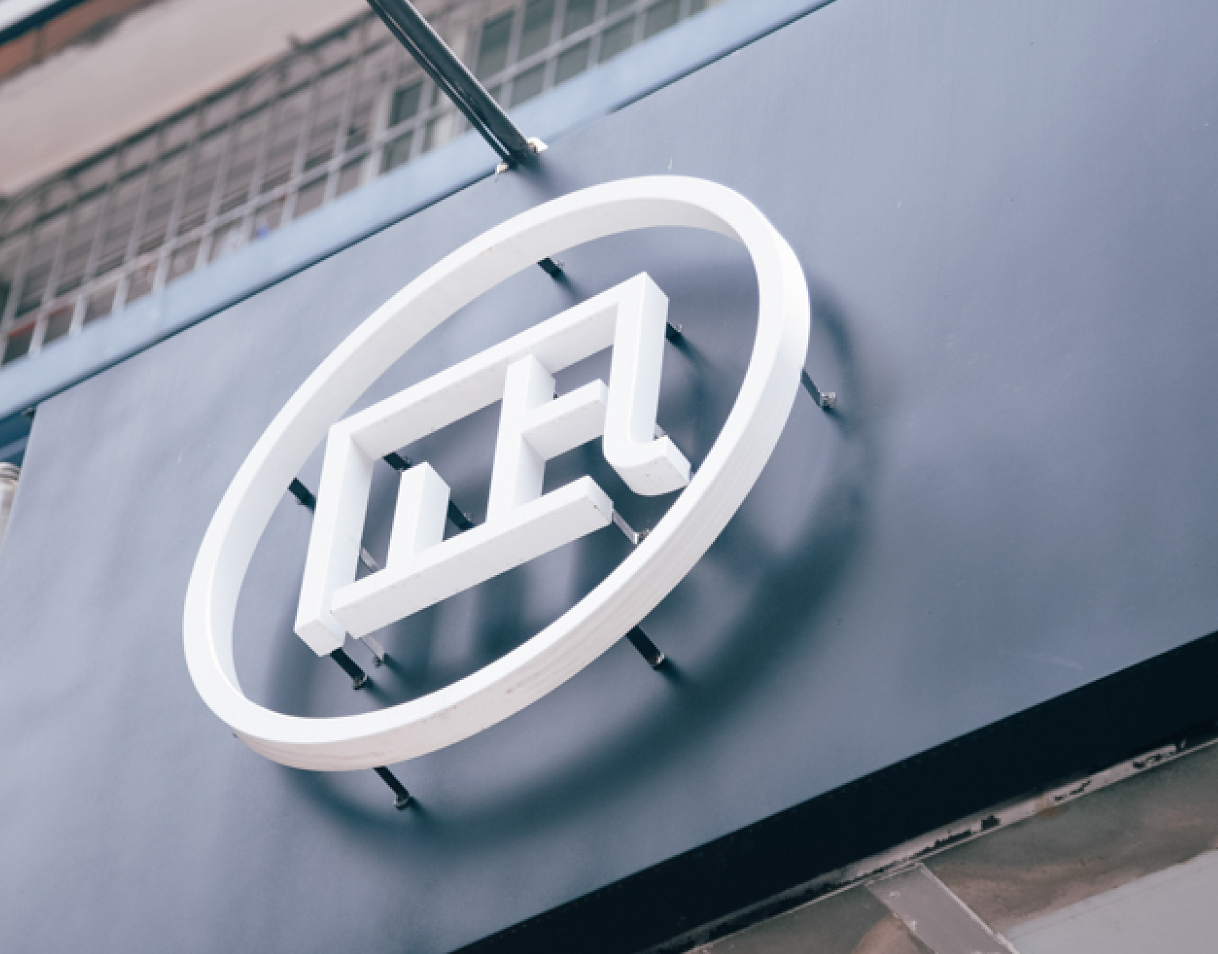
We first made Breakazine to Break-a-zine, and cut the name out of the corner with 90 degrees (right angle), symbolises Breakazine used 90 days broke the established routine, and furthermore can be combined with different words, e.g. BREAK A LIGHT, BREAK A RULE, BREAK A NORM, etc, to give the brand an infinite extention. Other than teenagers, higher-level college students and white-collar workers are being it’s readers.
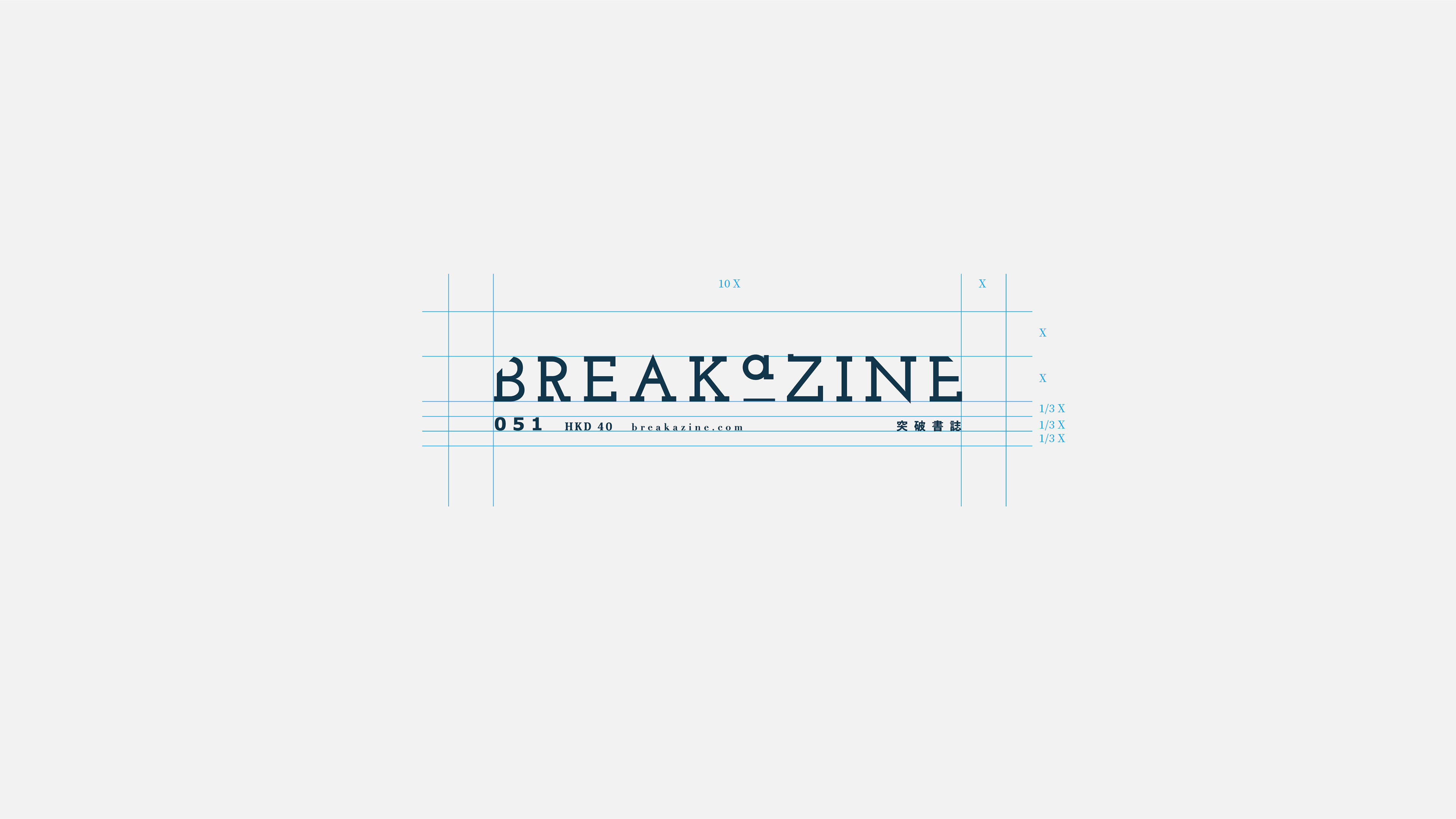
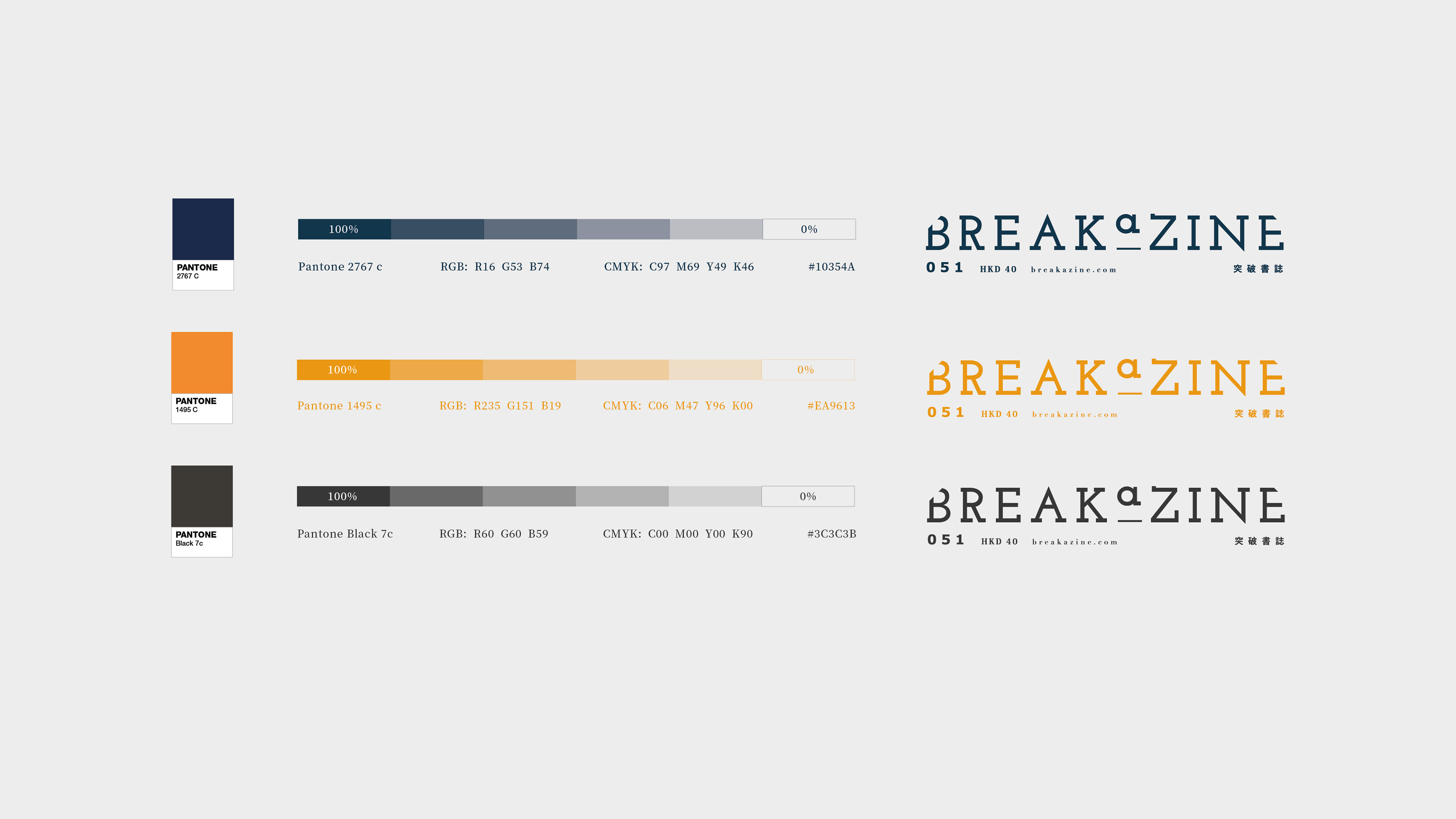
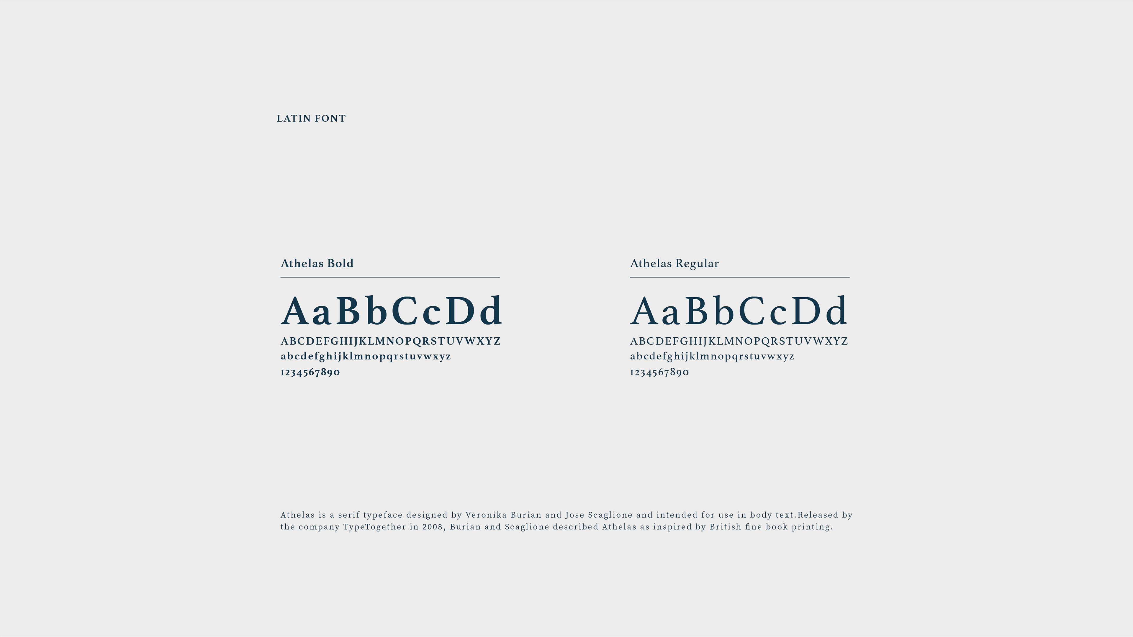
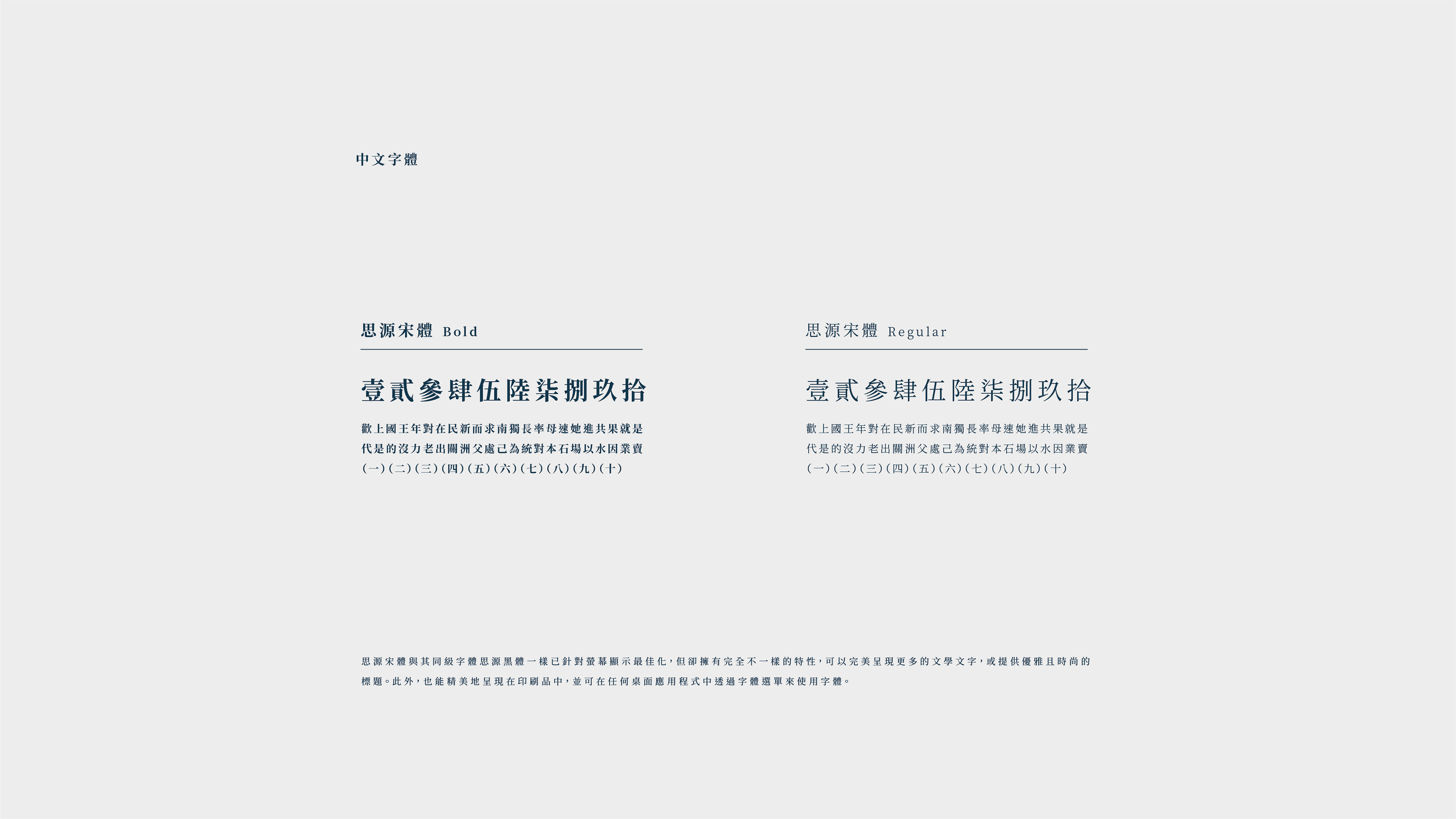
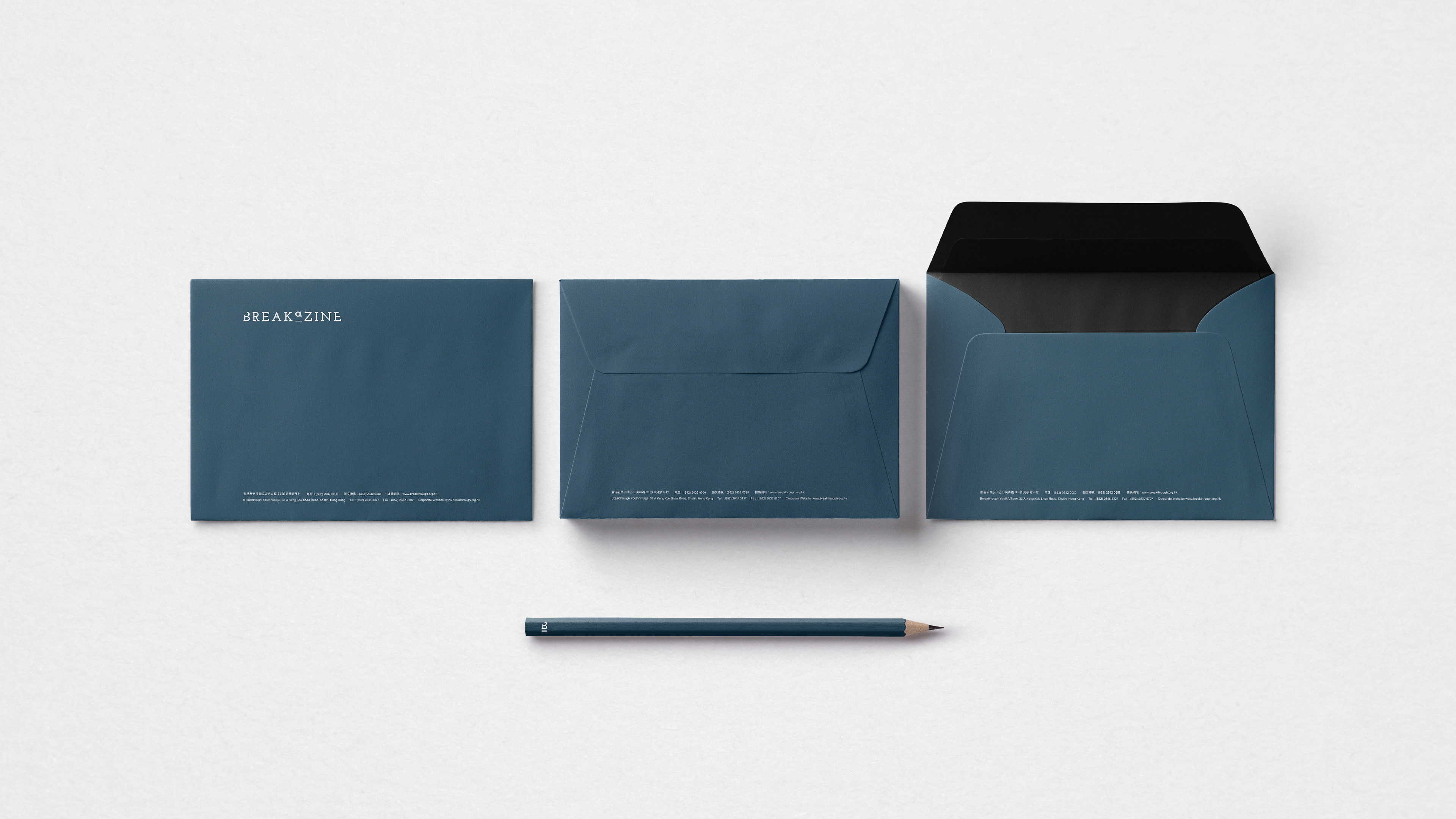
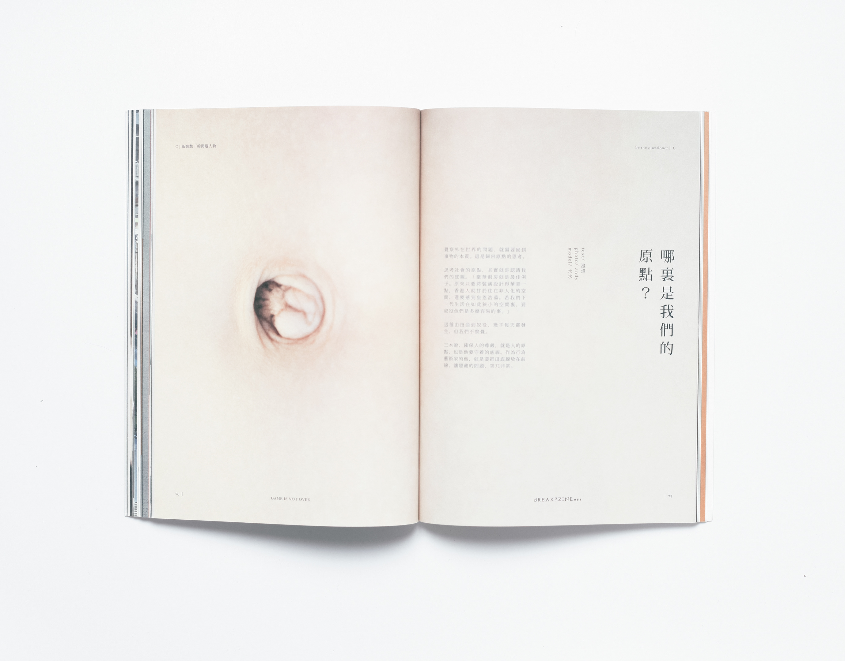
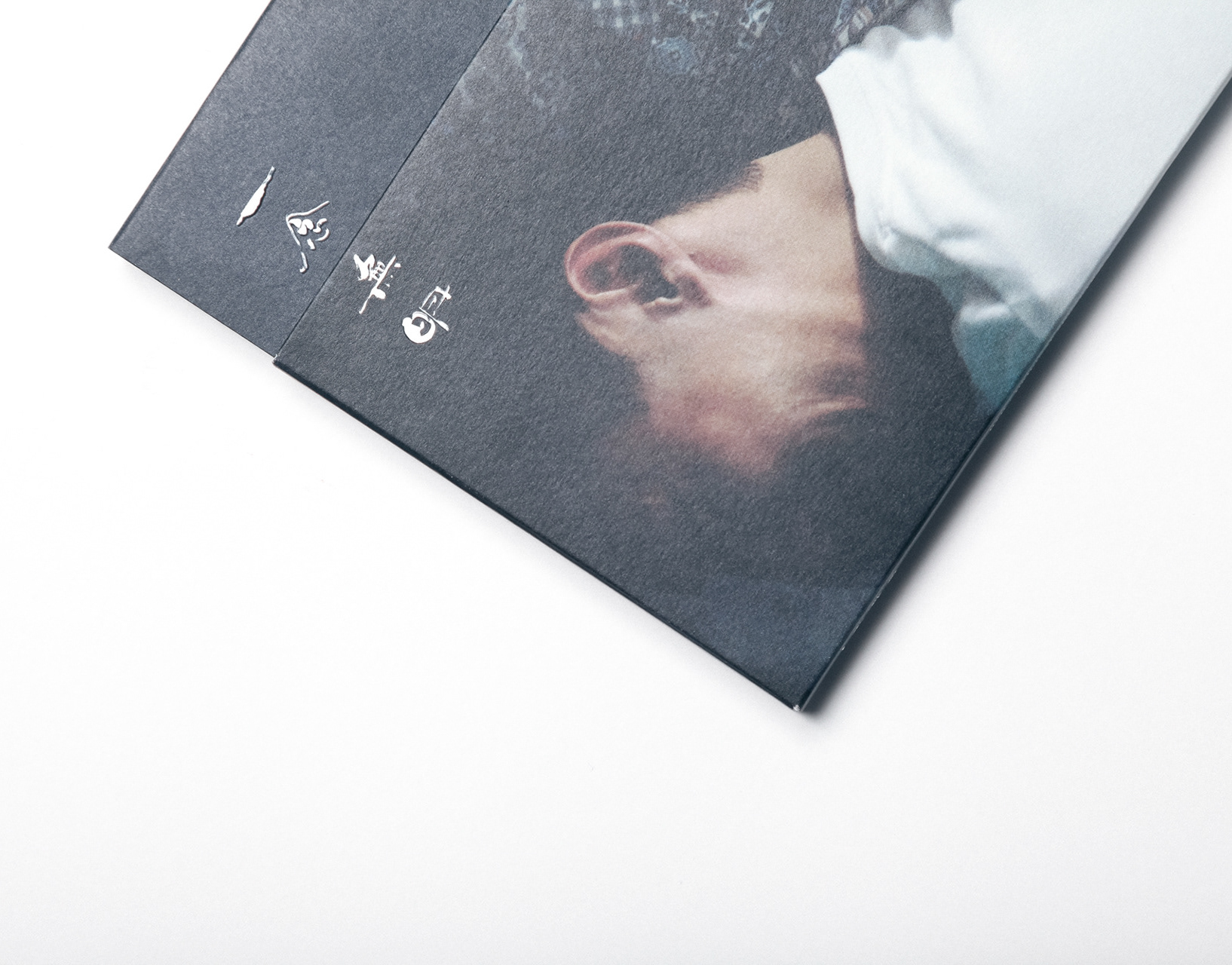
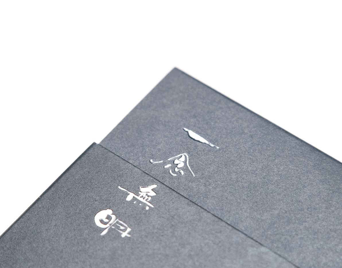
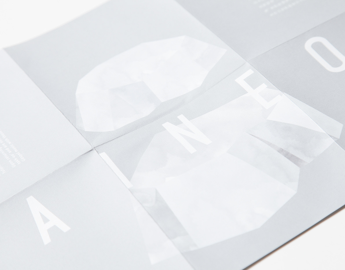
To being creative and fresh, the tradition of Breakazine was to team up with different designers or design firms, but it also caused a huge image difference in every issue. In this situation, we standardised the grid system and fonts of Breakazine in order to make it be unity and will not give too much limit to other designers.
—
BREAKAZINE 是香港文化雜誌,誕生於2009年。在雜誌成立初期,目標讀者是中學生。隨着初期的忠實讀者進入社會,雜誌也隨之成長,加入了更多的社會議題和設計元素,令雜誌越催成熟,影響力越來越大。適逢雜誌從雙月刊轉成季刊,他們希望我們為其品牌升級。
我們首先吧Breakazine分解成Break-a-zine,並用90度(直角)把名字切出缺角,寓意雜誌用90天的時間打破既定常規。並且可以和不同的字組合,令品牌的可以有無限的延伸性。如BREAK A LIGHT, BREAK A RULE, BREAK A NORM等等。讀者定位也提高到知識水平更高的大學生和白領階層。
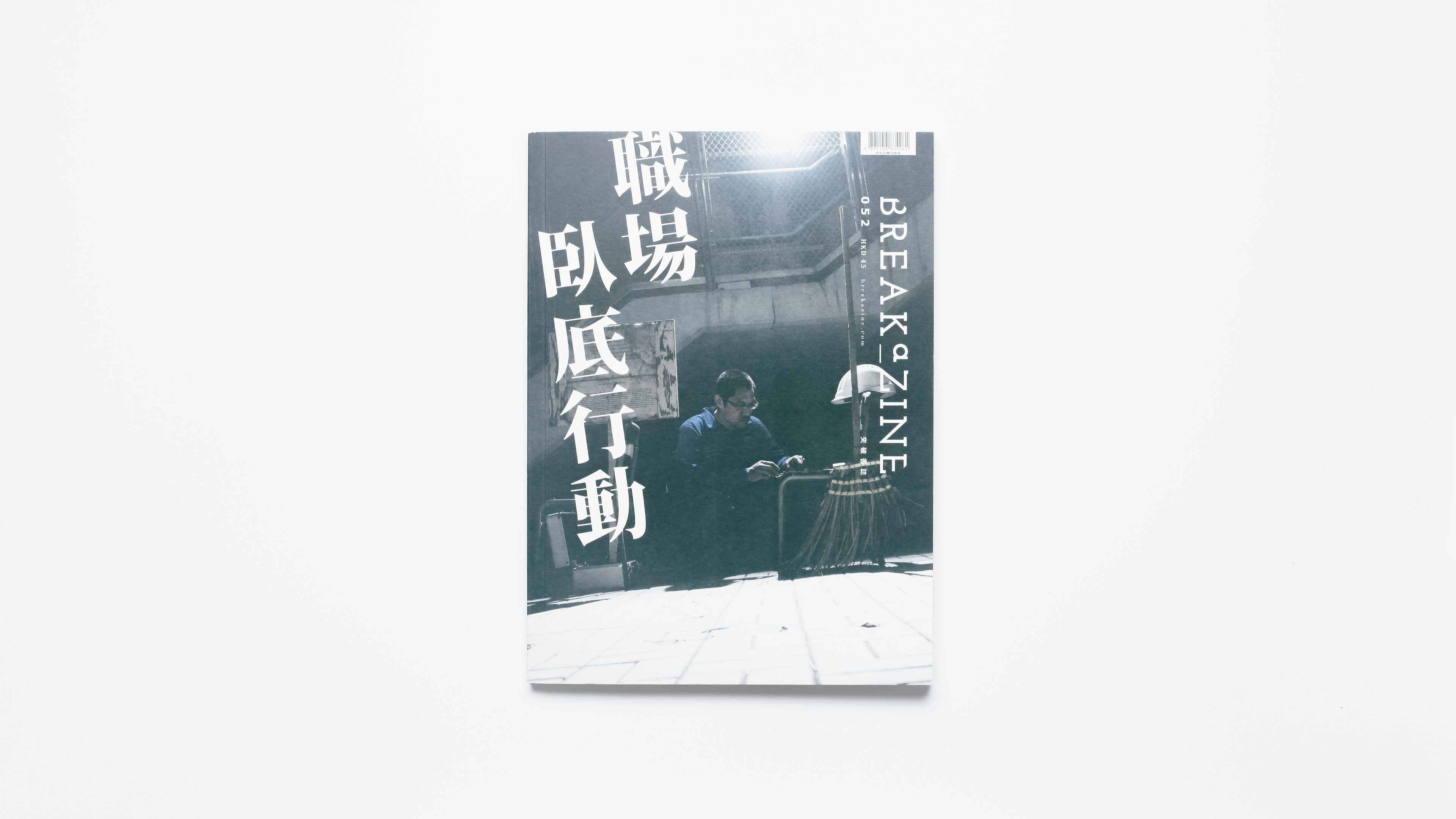
Breakazine的傳統是每一期都會找來不同的設計師或設計公司合作,可以令每一期都有不同的創意碰撞,提高新鮮感。但因為每個設計單位的排版風格也不同,所以也造成了每一期都有很大的形象差異。為此我們標準化了雜誌的網格系統(grid system)和應用字體(Font),令每期的風格更具統一性,又不會令設計單位受太多限制。