// Breakazine! 突破書誌 #049《唞氣》- 雜誌設計 Magazine Design //
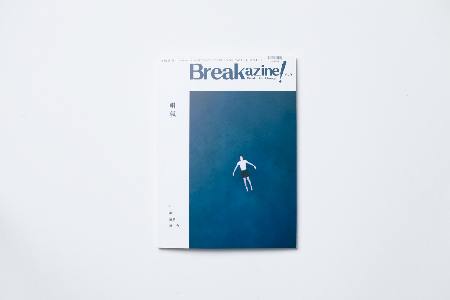
《Breakazine!》是一本香港雙月刊文化雜誌。 我們受邀為第49期進行設計和創意策劃。這期的主題是「情緒」。封面題目是「唞氣」(廣東話,意思是喘一口氣)
設計從不為內容服務,而是內容本身。所以這次的合作我們高度參與雜誌的內容篩選和編排。
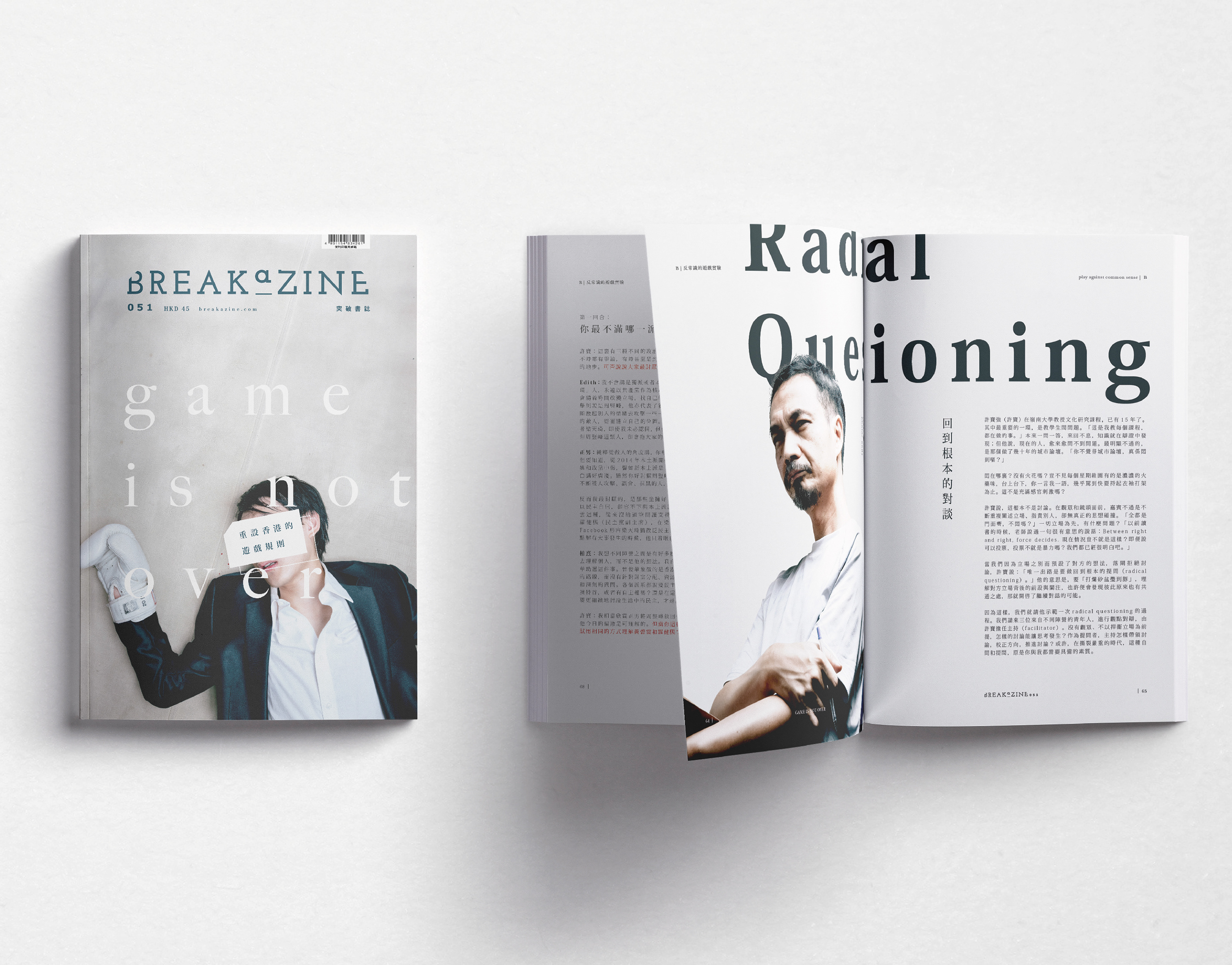
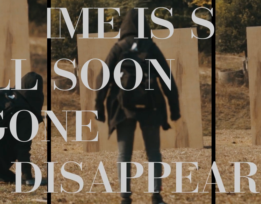
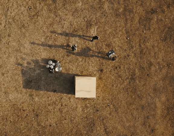
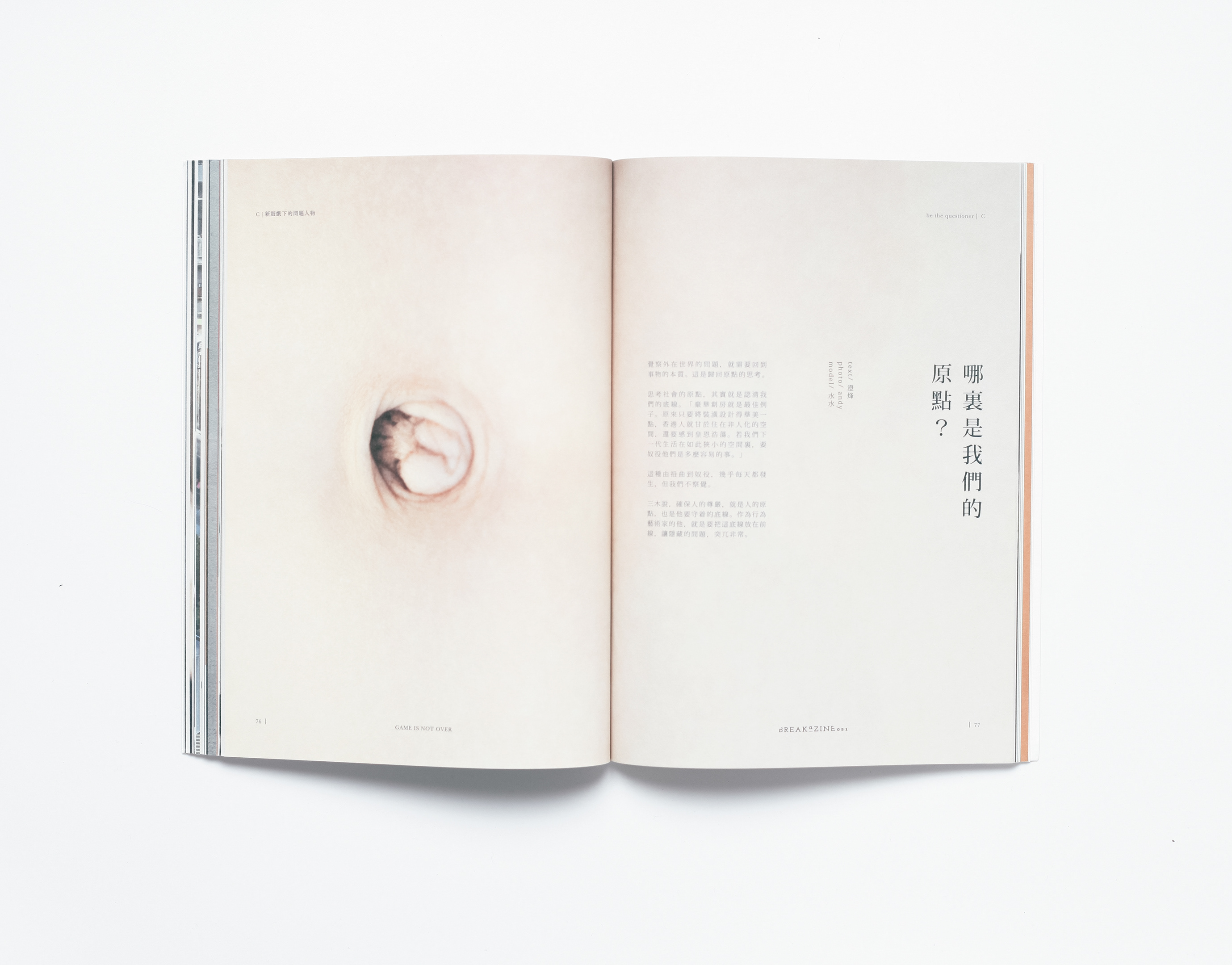
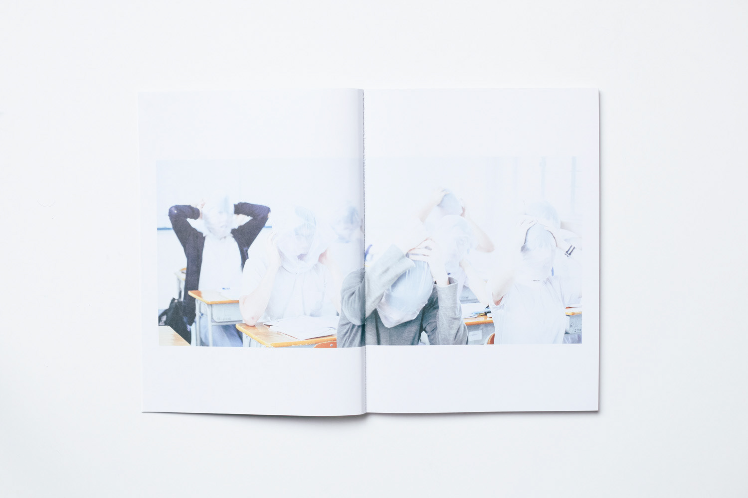
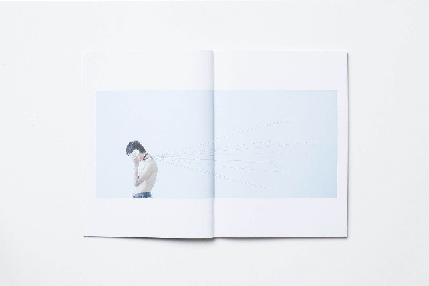
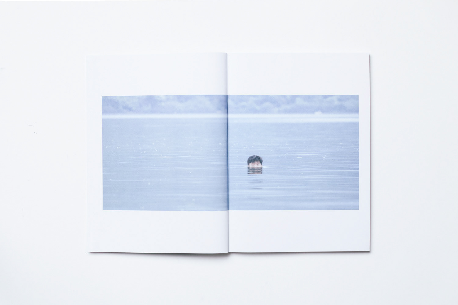
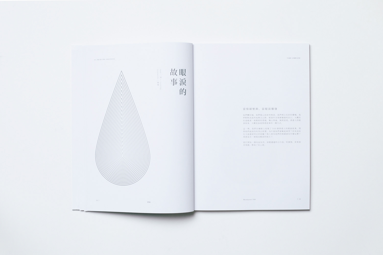
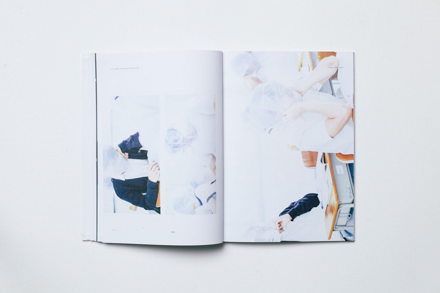
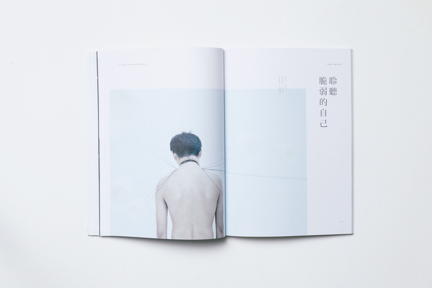
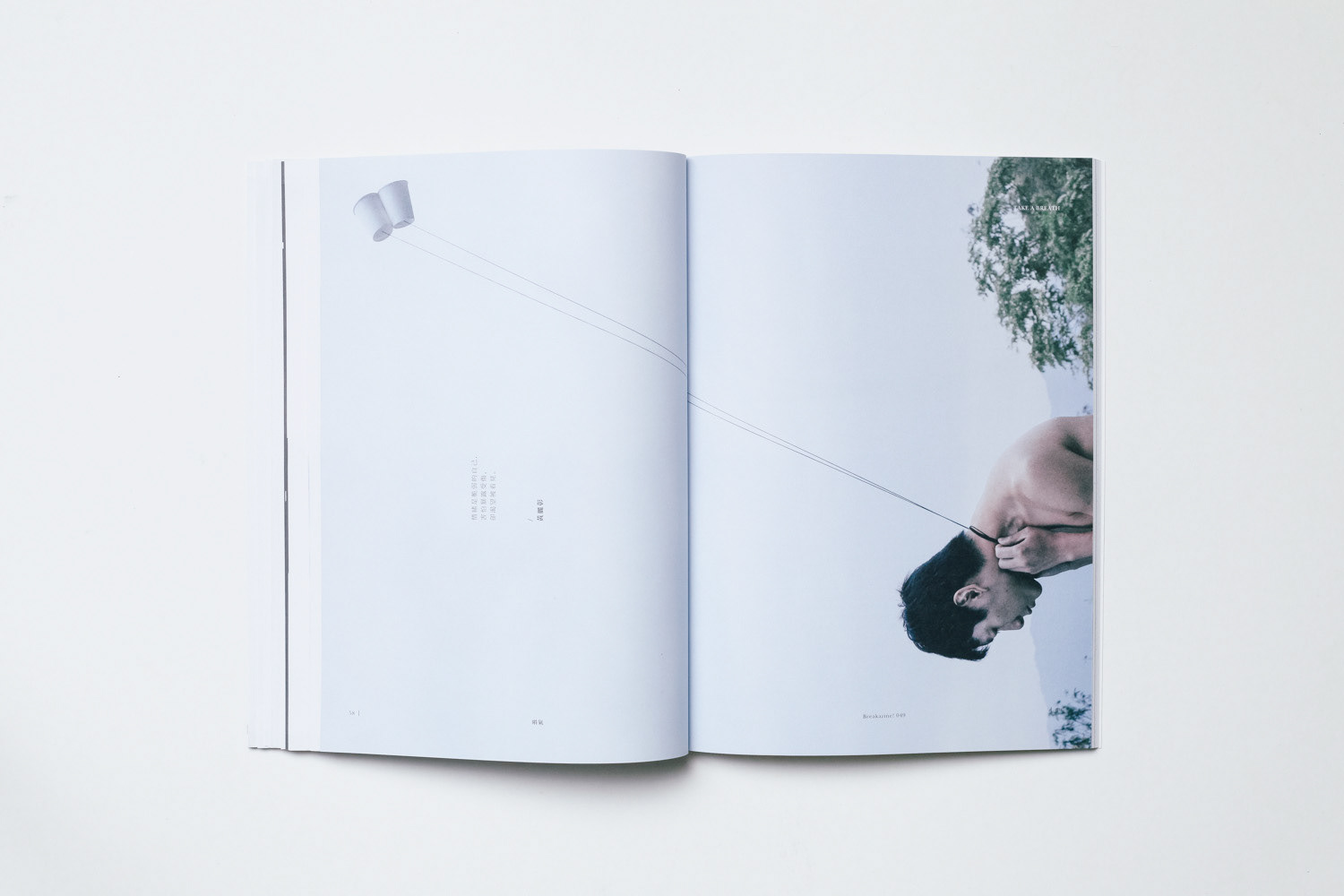
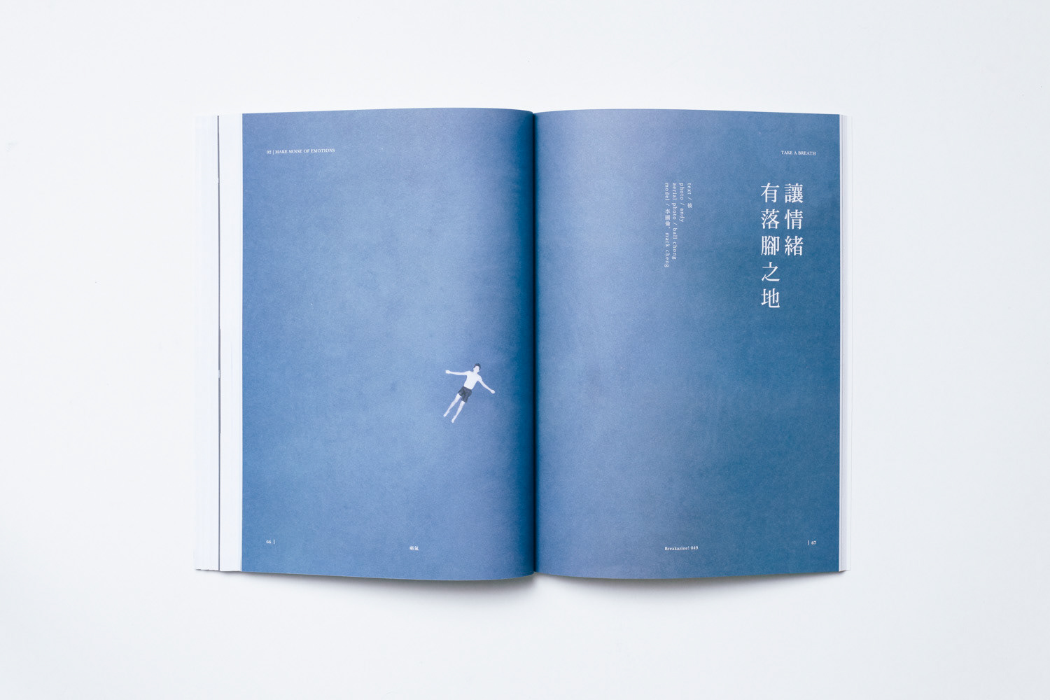
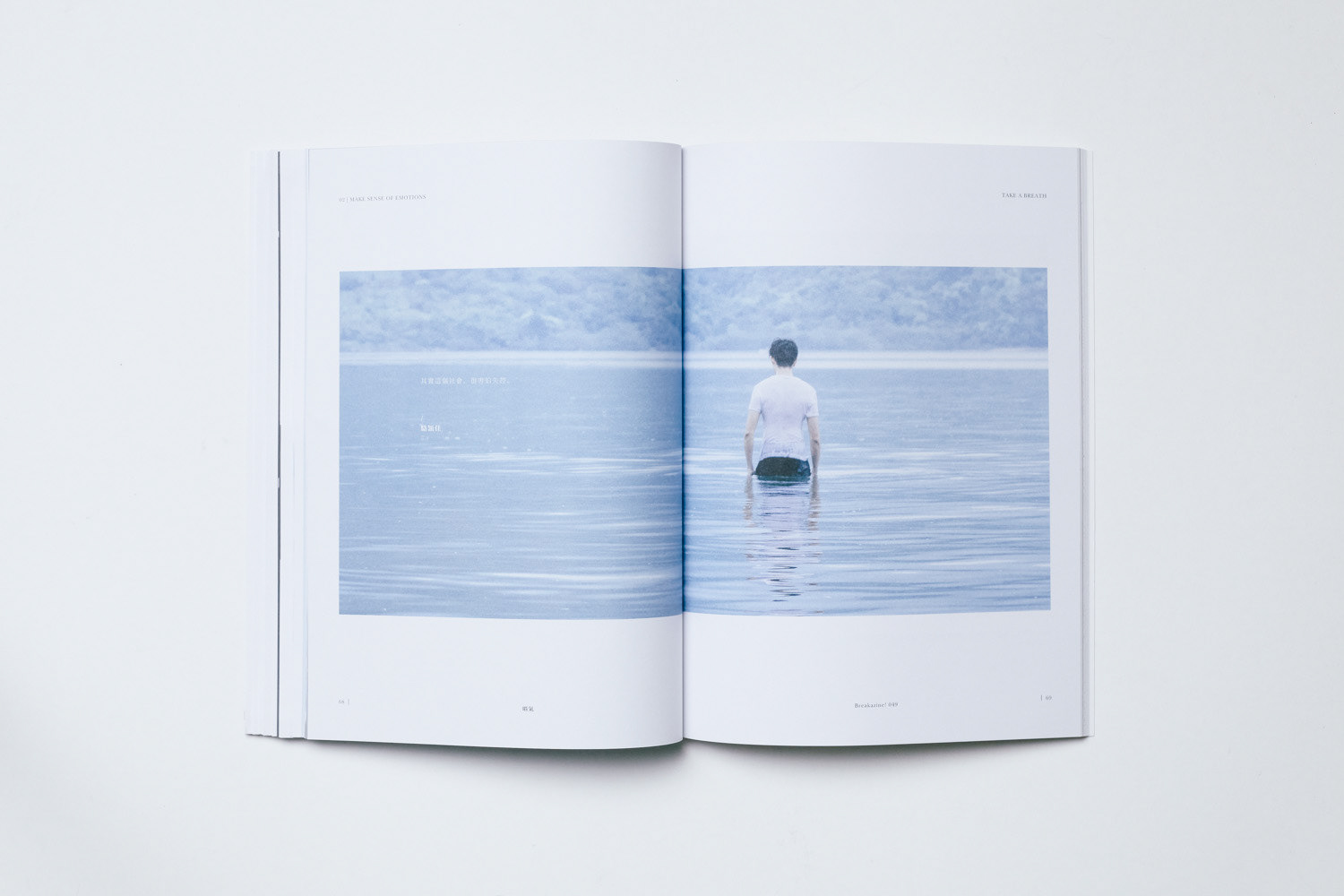
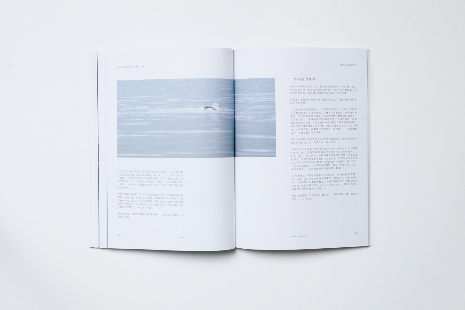
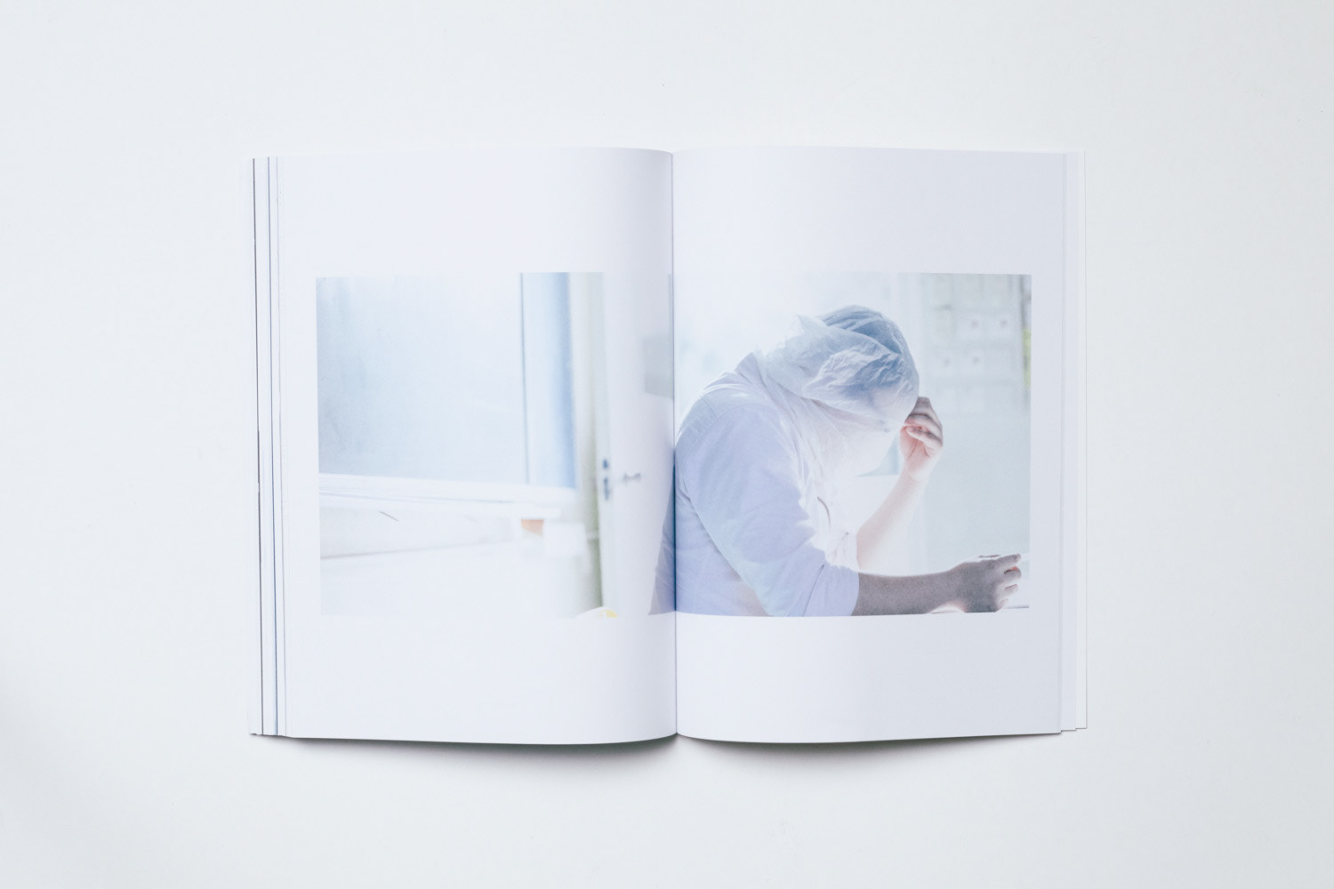
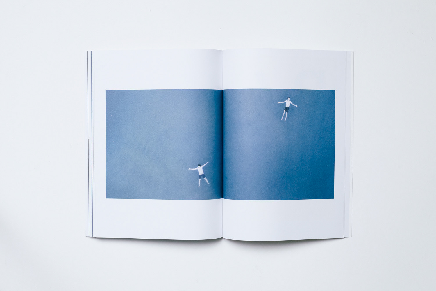
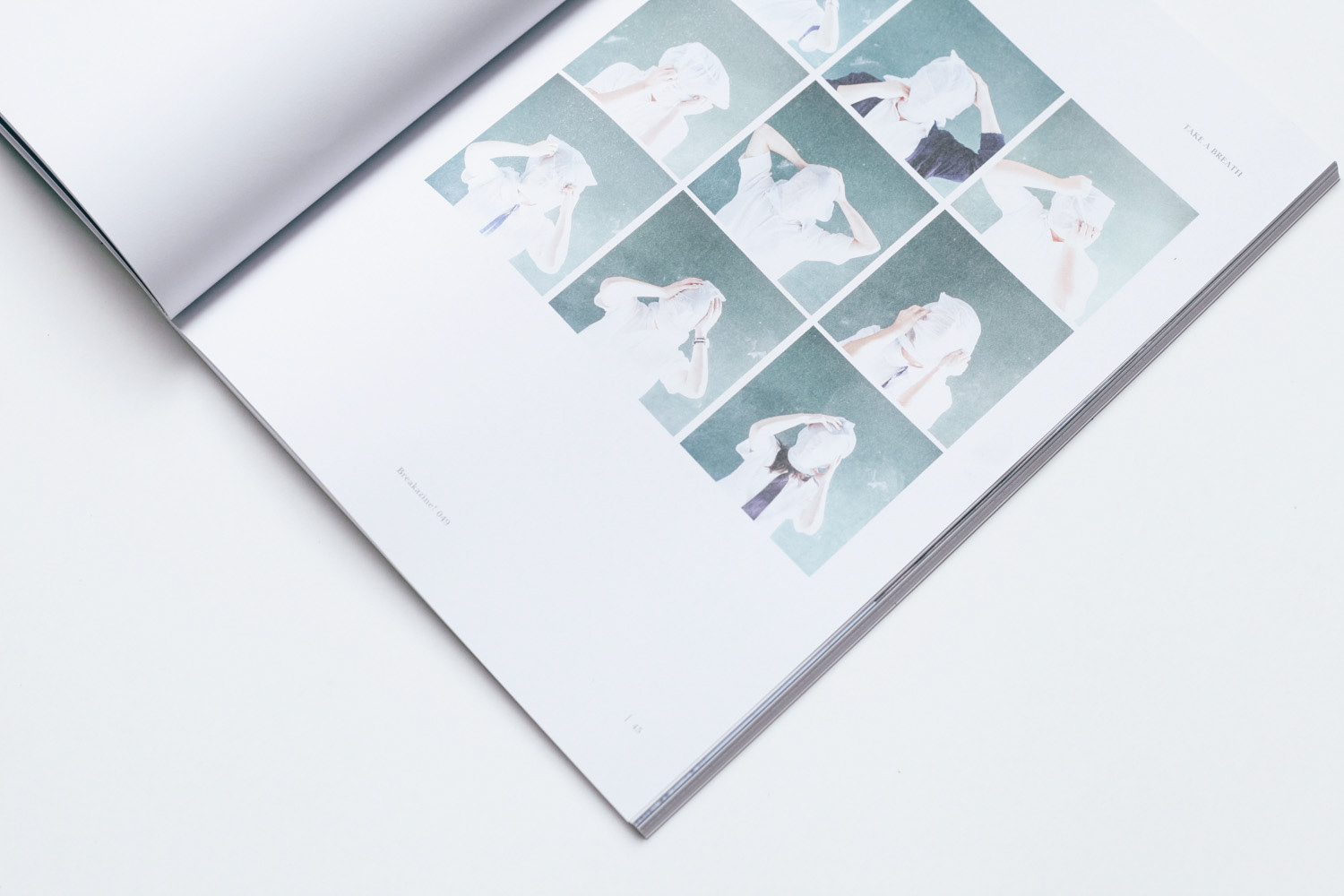
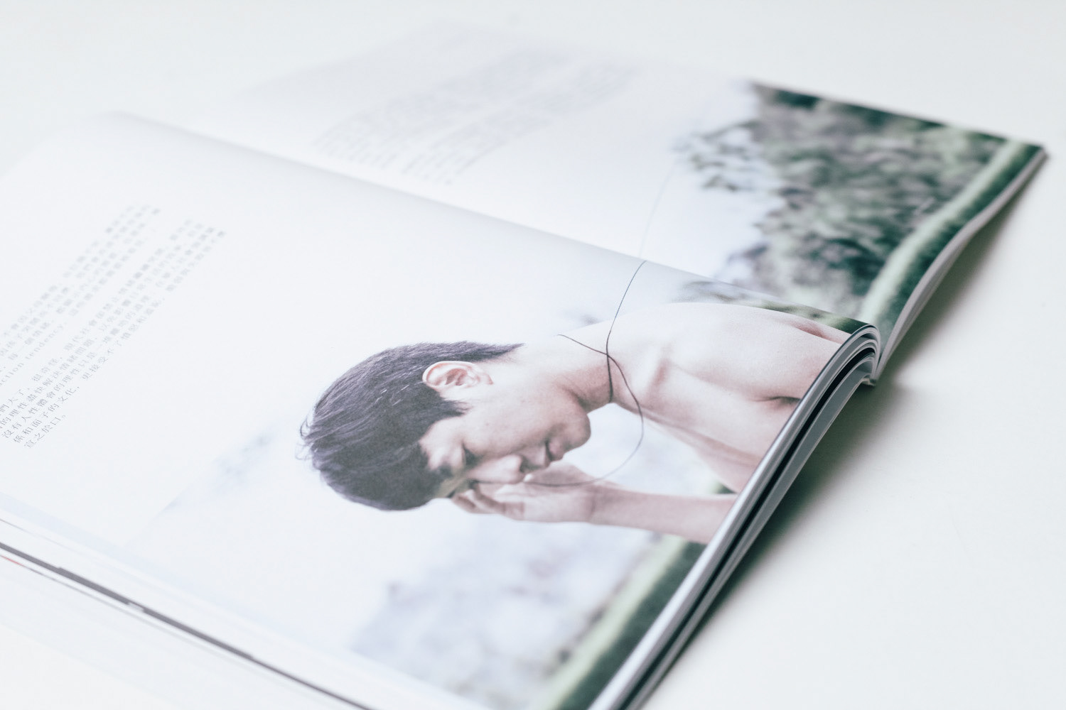
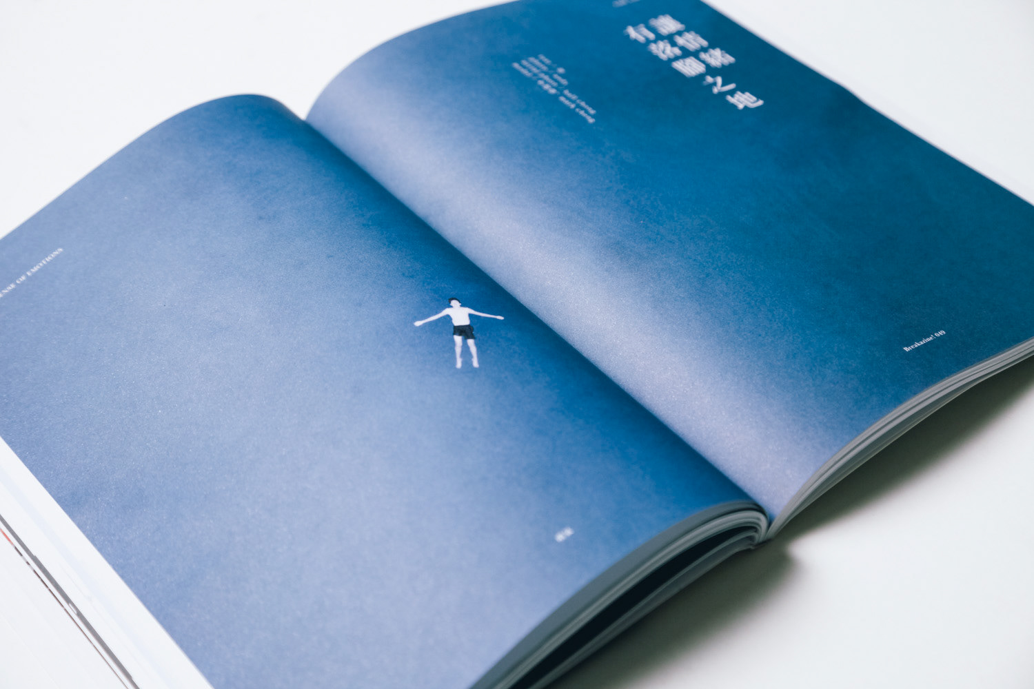
首先,我們為本期創作了三系列照片,分別是「窒息」(學生以膠袋蒙頭)、「以言傷人」(以傳聲筒線絞脖子)和「落腳之地」(漂浮在大海上的人)。分佈在雜誌內容的前中後三部分。「前部分」在開首的「你還好嗎?」扉頁之後,以三張照片吸引讀者的好奇,埋下伏筆;然後在「中部分」配合三篇訪問展出多張照片帶出內容的爭議性;最後在結語後也以三張照片作結,描述意料之外的結局,帶出反思。
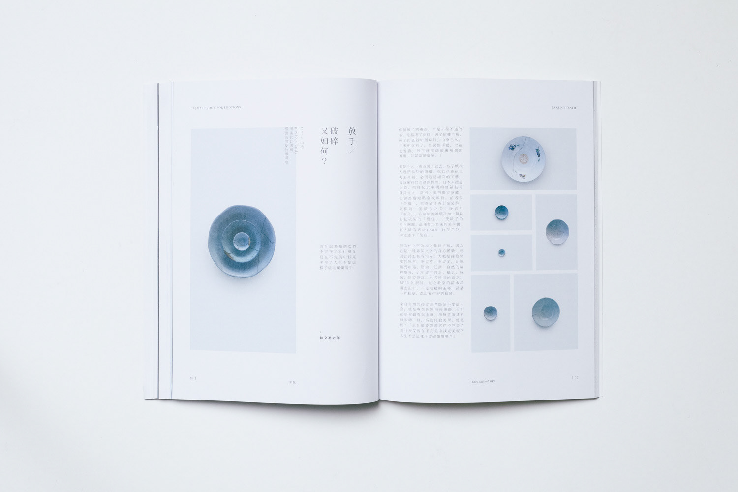
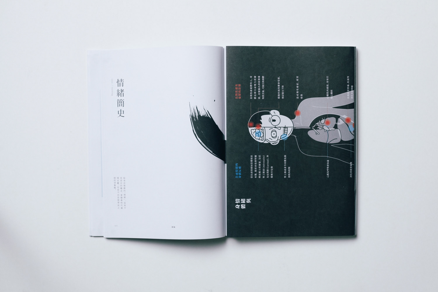
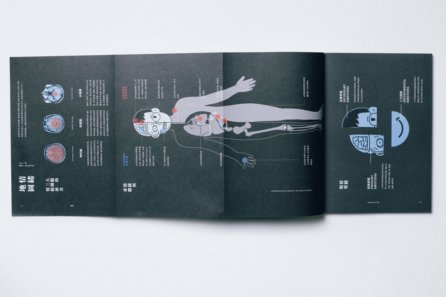
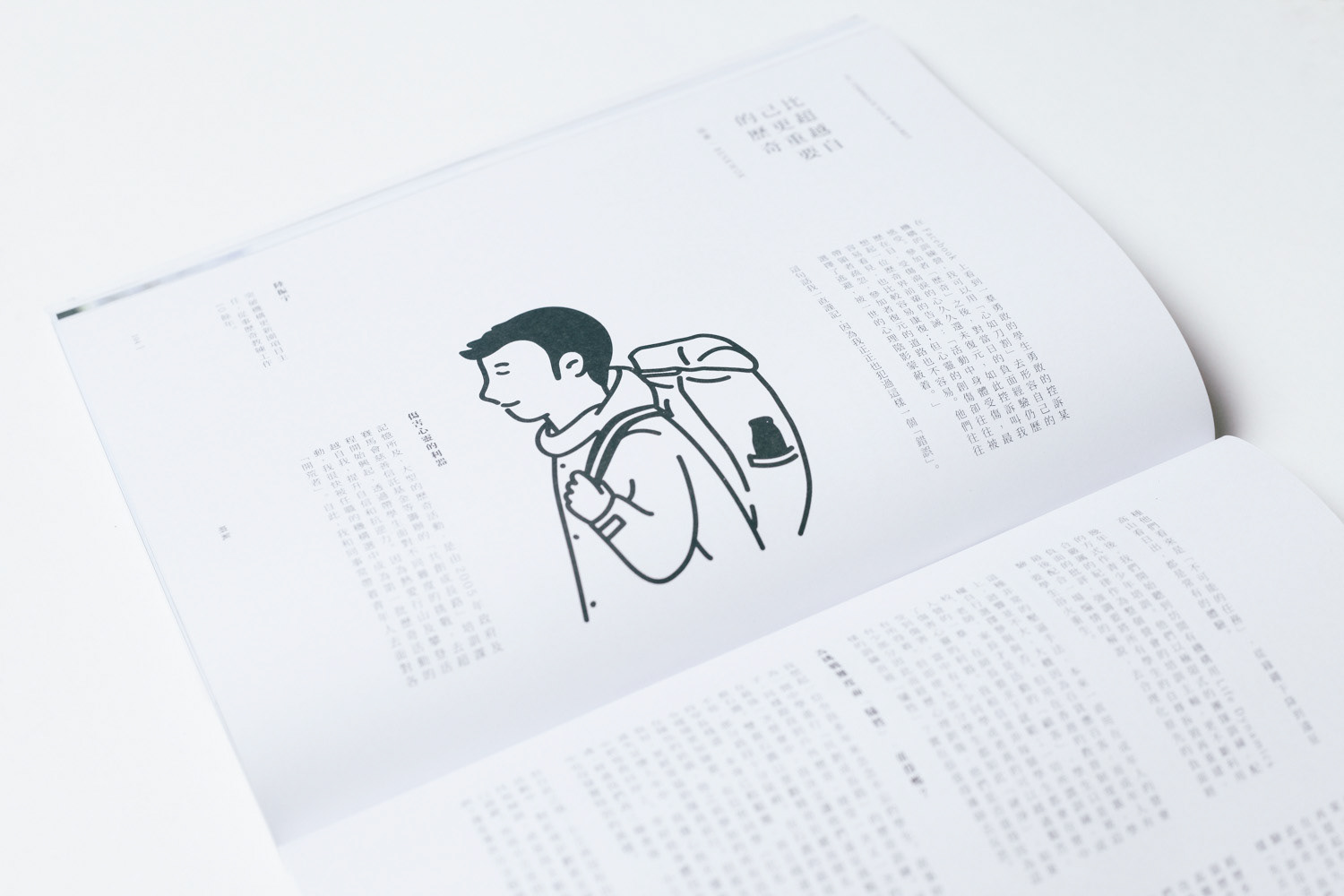
我們也為雜誌重新設計的版式,保留更多空間感,透過字距、行距和網格系統(grid system)的微調放慢閱讀節奏。這個做法的目的是為了配合這期帶有點沉重的主題內容。我們也為每個部分設計了大量信息圖譜和原創圖像。
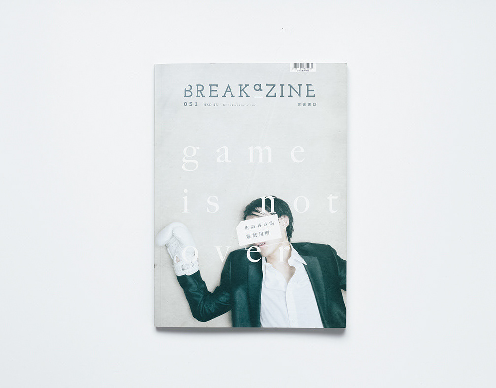
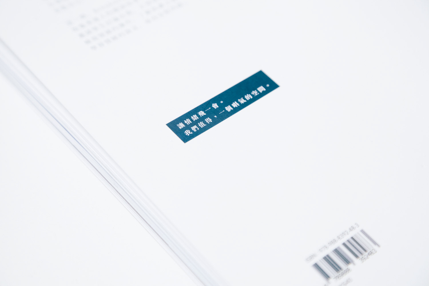
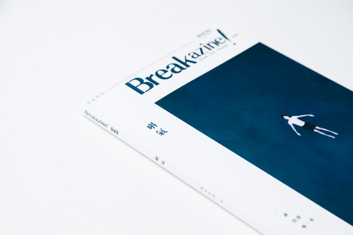
最後我們選擇了一張男孩漂浮在海面上的照片作封面。遠看像是在一片藍天上飛翔,近看就像是一具死尸在茫茫大海上漂浮。配上編輯的主題文字 -- 讓情緒飛一會。
--------
"Breakazine!" is a Hong Kong bimonthly cultural magazine. It contains interviews, authoring and in-depth coverage of the same topic in each volume. We were invited to provide creative and design services for the volume 49, with the topic: emotion. The cover title is "唞氣" (means “pause for breath” in Cantonese)
We think that design never serves content, but the content itself. So we highly participate in the content screening and arrangement of the magazine.
First of all, we have created three series of photographs of the current theme that spread to three parts of the magazine, namely "suffocation" (students’ heads covered with plastic bags), "to hurt people by words" (a man head wrung with loud hailer cable) and "landing place" (a man floated up to the surface):
- “Front part”: After the title page “are you alright?”, to attract readers’ eyes and arouse their curiosity, carries a foreshadowing.
- “Middle part”: To bring out the controversial content with photos and three main articles.
- After the conclusion of the magazine, we use three photos to sum up, describe the unexpected outcome, bring out reflection.
We also redesigned the layout for the magazine, keeping more extensity, slowing the pace of reading through kerning, line spacing and the grid system. The purpose of this practice is to tie in with the heavy theme, including "discuss suicide", "story of tears" and "imperfect perfection" and so on.
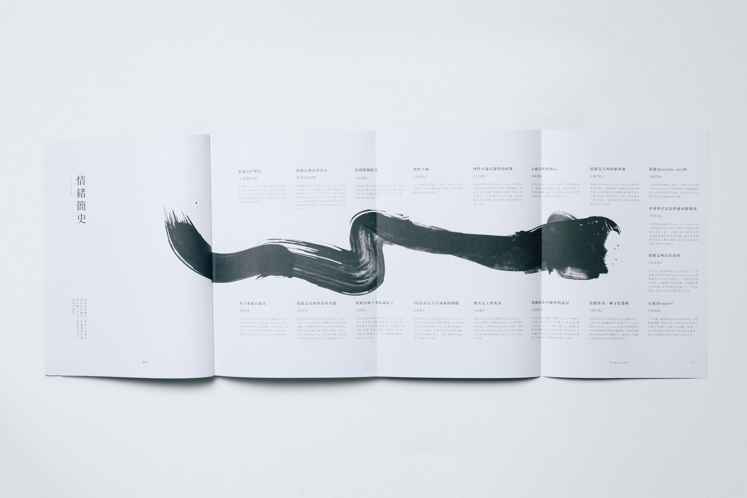
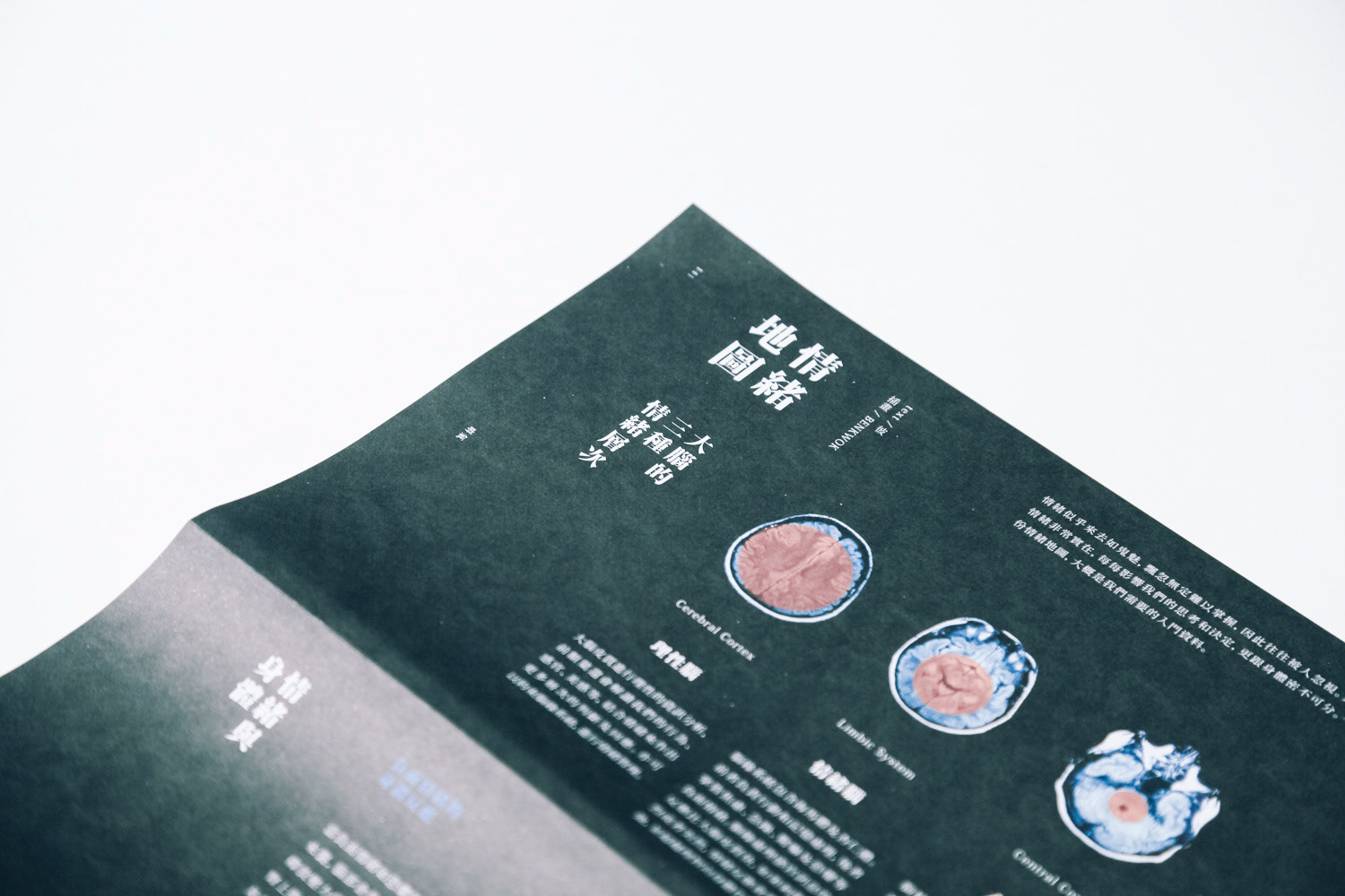
We also designed infographics and original images for each section. For example, created a picture of ink for the "brief history of emotion" which is printed on a long fold, with a turning of the pen to bring out the different stages of emotional interpretation; we use the form of anatomical map to make "emotional map", to interpret the relationship between emotion and physiology; also interpret the interaction with the emotions and dreams for the three black and white images, and to bring out the tears from for the reader's tear stories. Hoping to use a concrete design to make readers substitute into the abstract text emotions more easily.
Finally, we chose a photo of a boy floating up to the surface for the cover. It looks like flying in the blue sky, or a dead body floating on the sea. Accompanied by the editorial theme text – “let the mood fly for a while”.