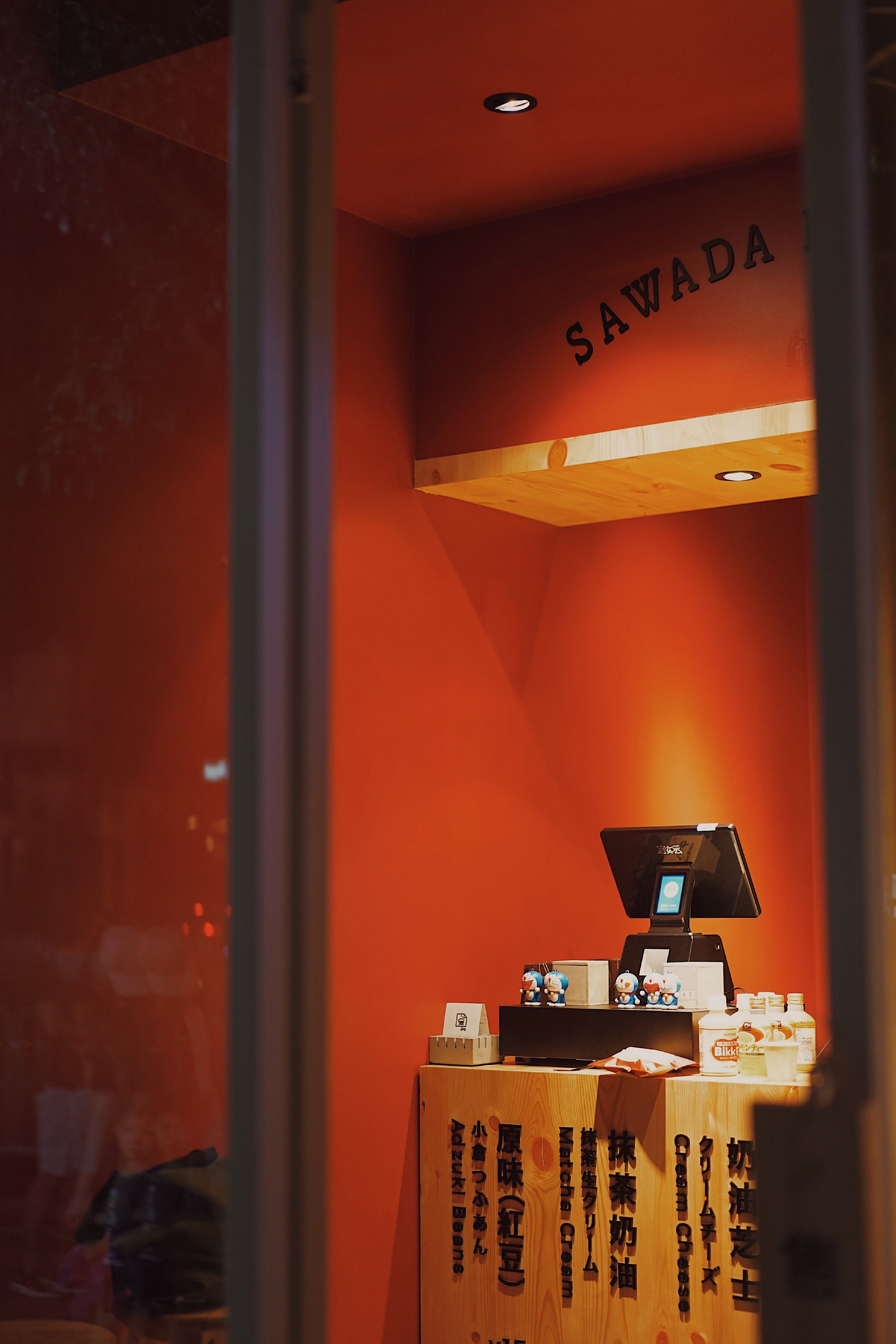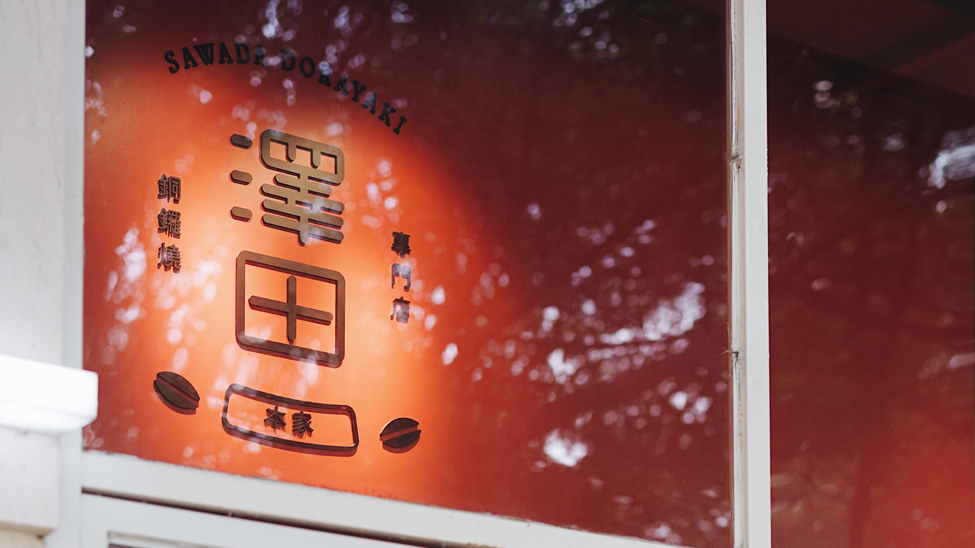
SAWADA DORAYAKI
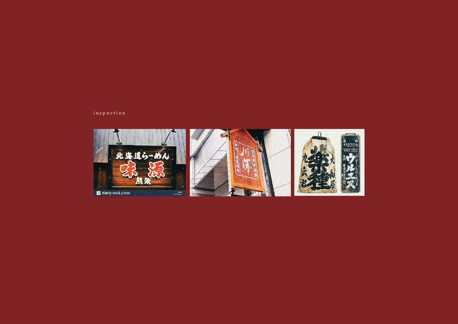
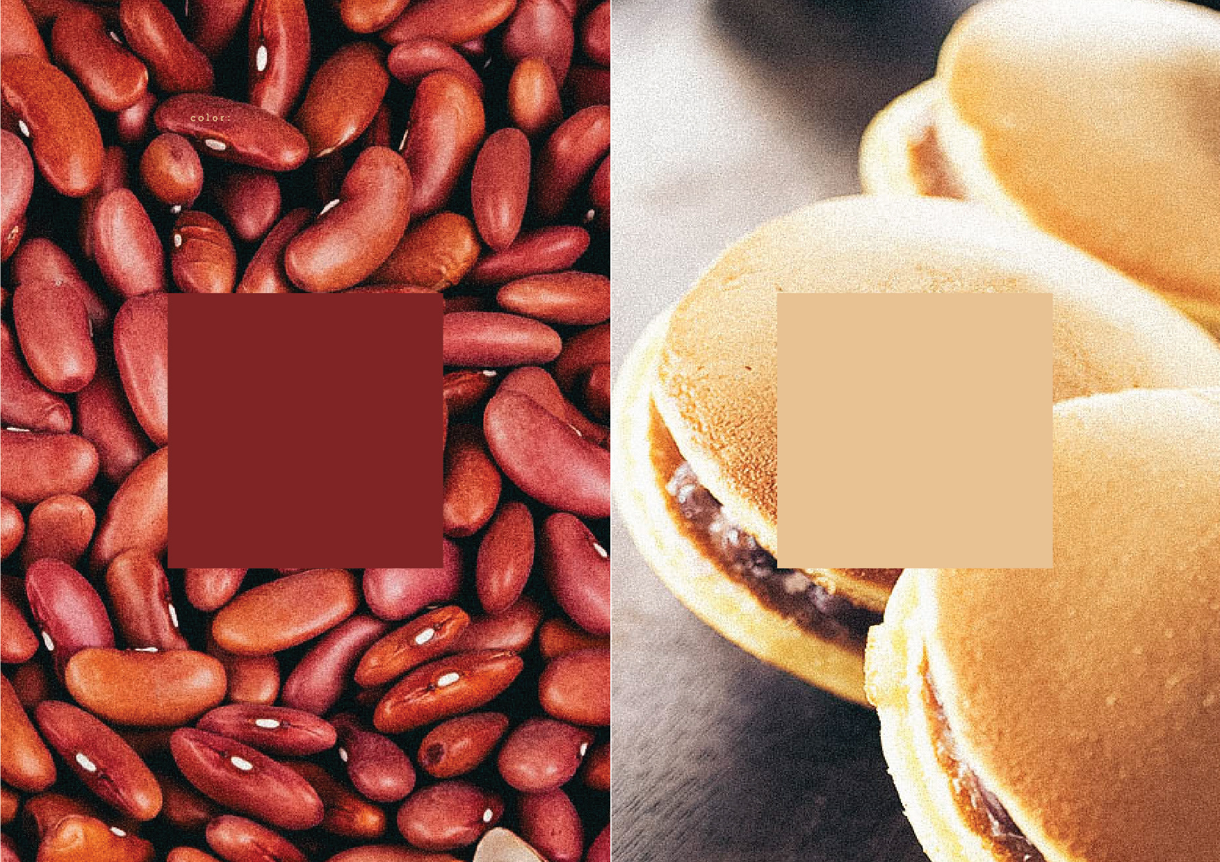
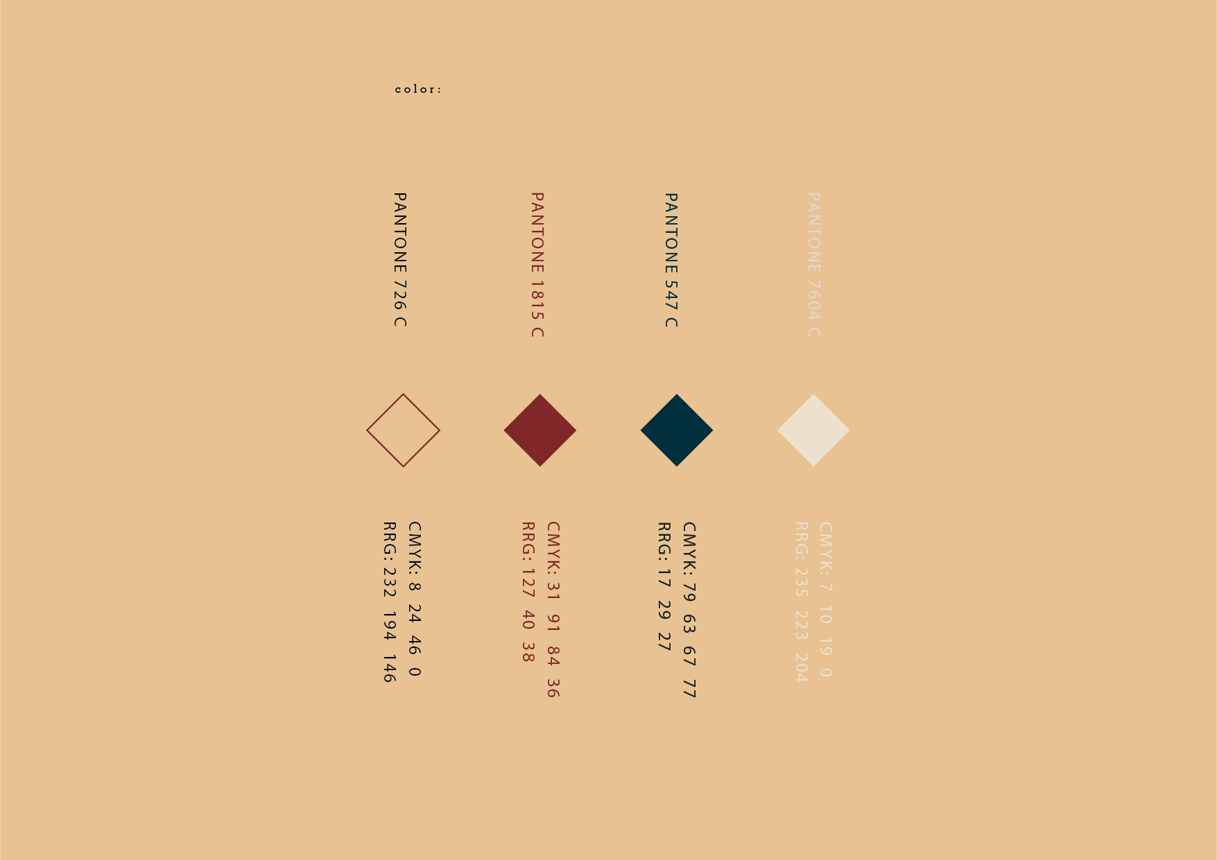
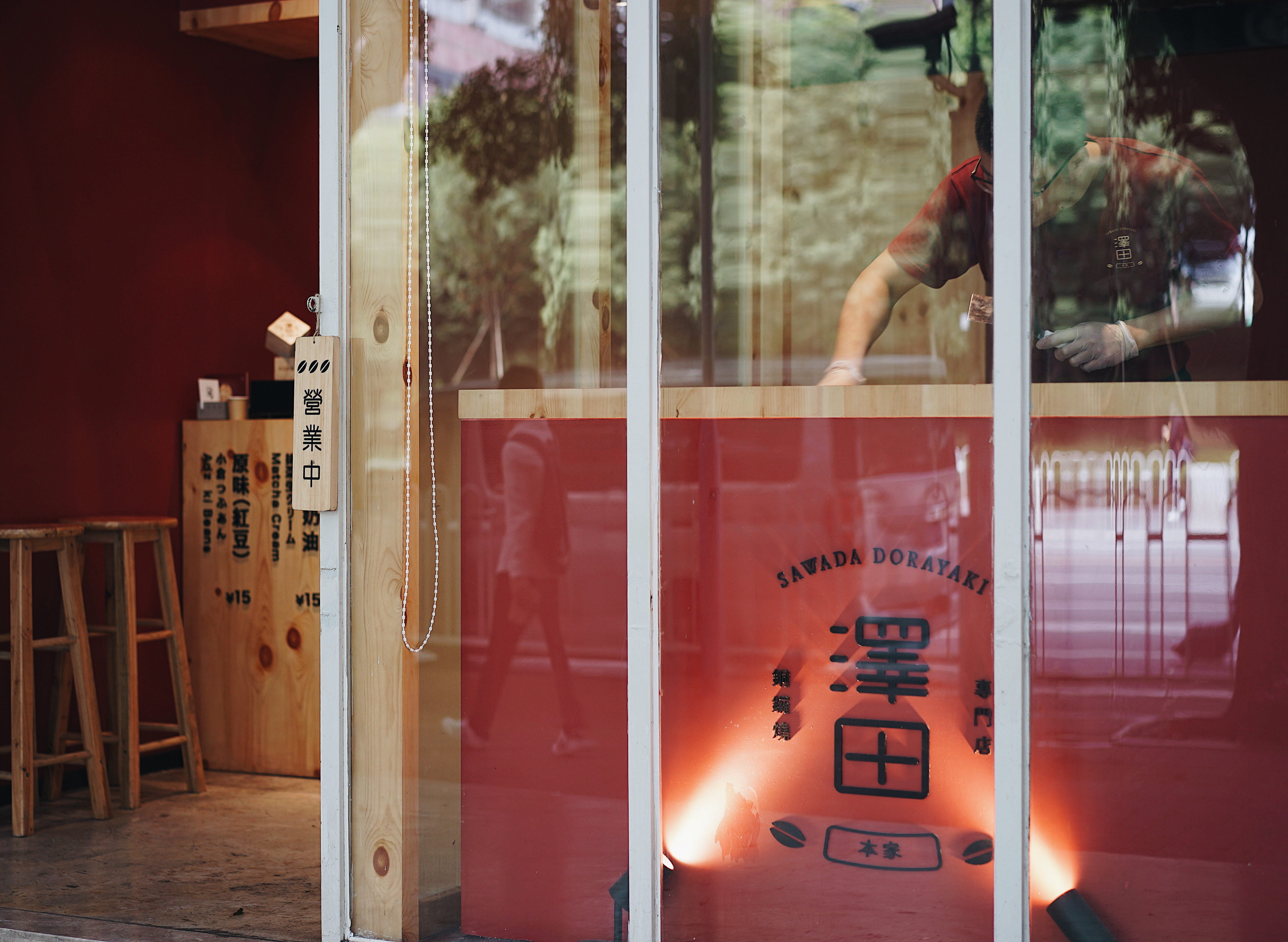
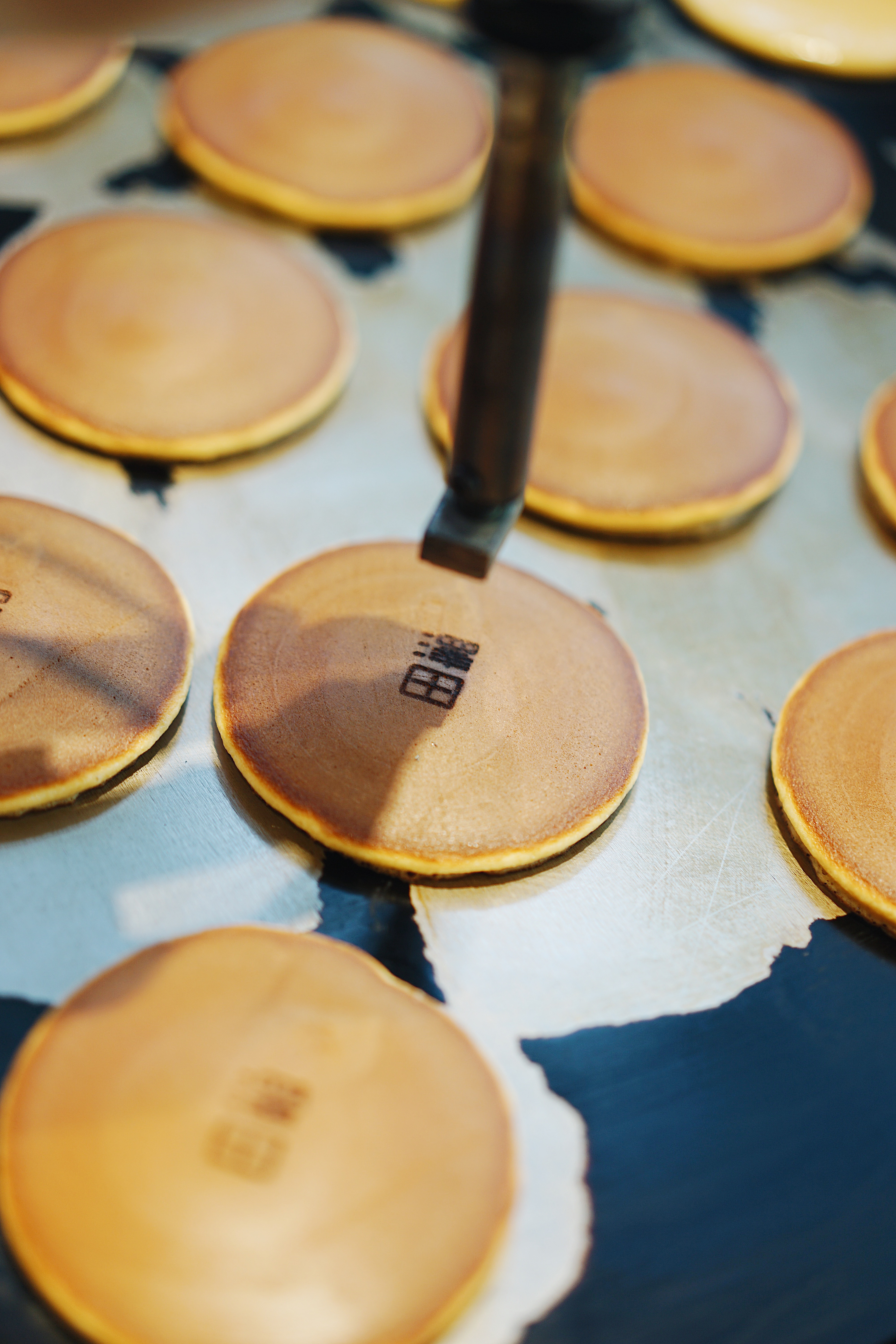
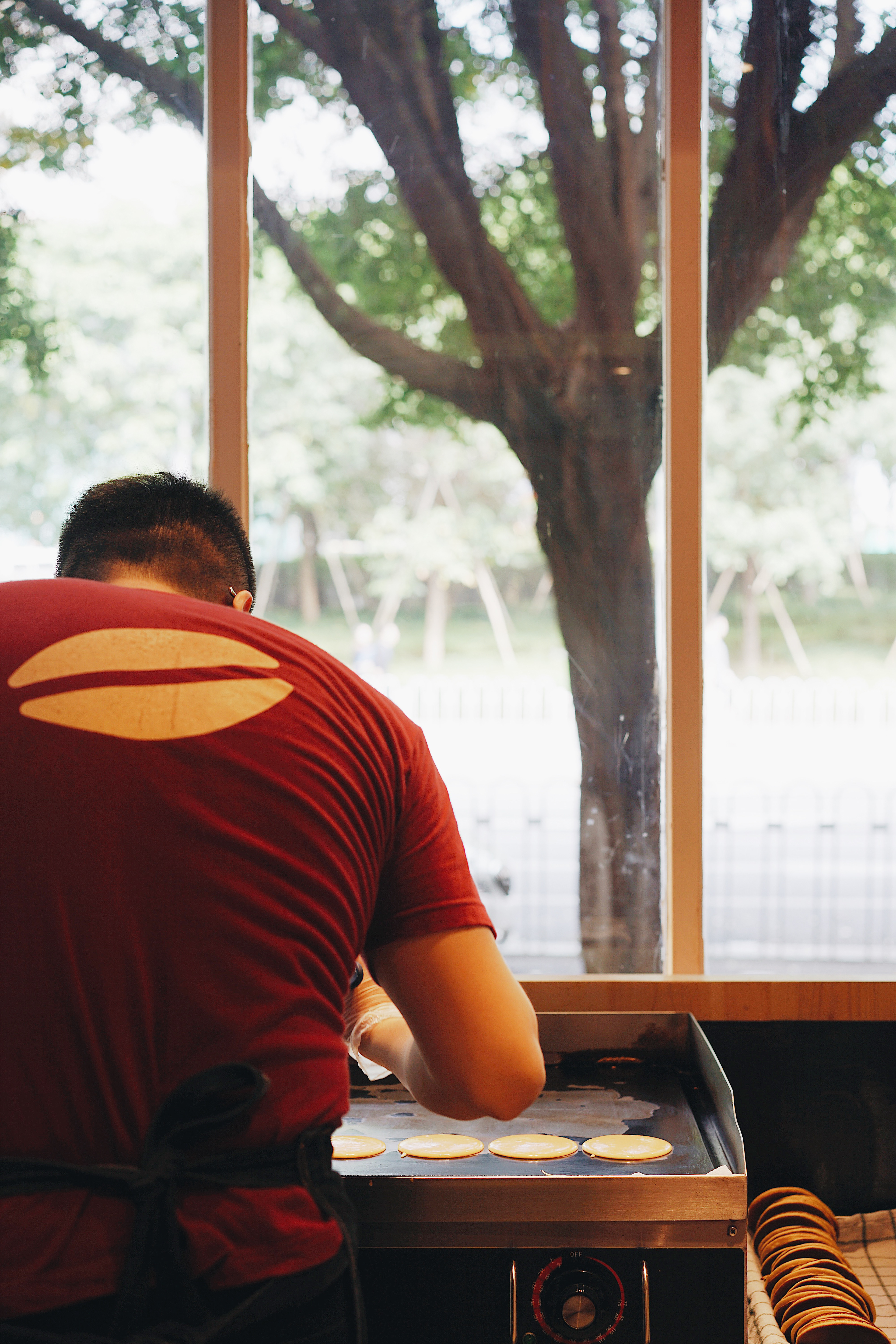
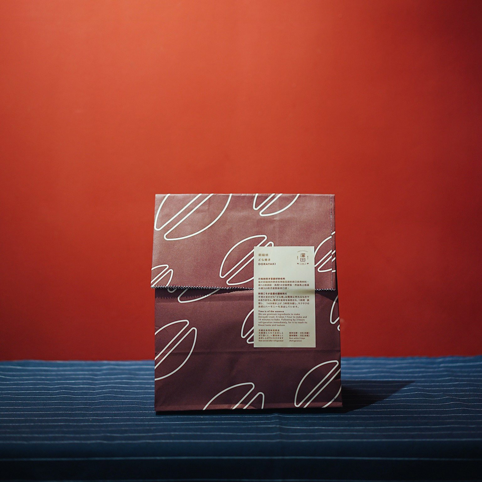
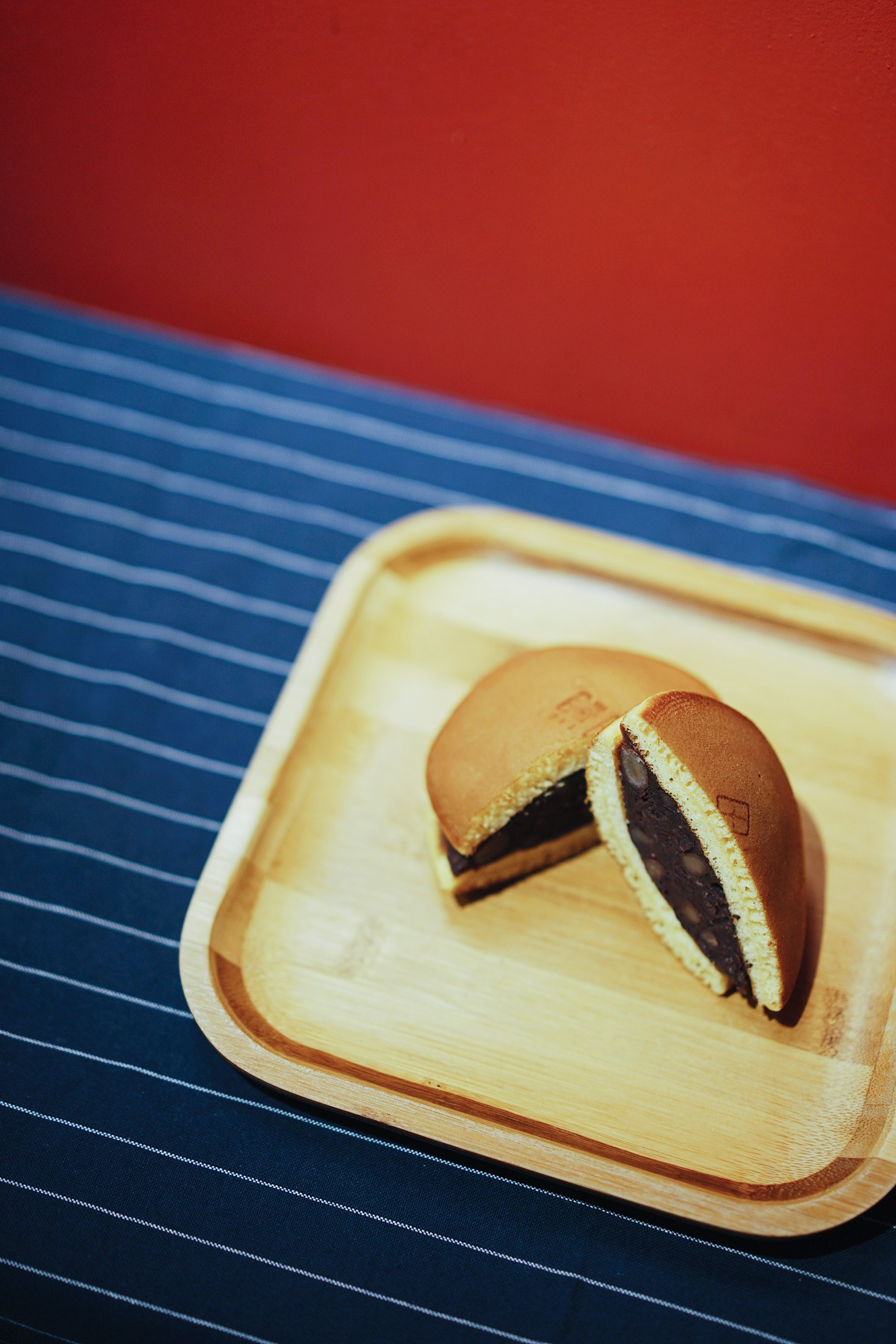
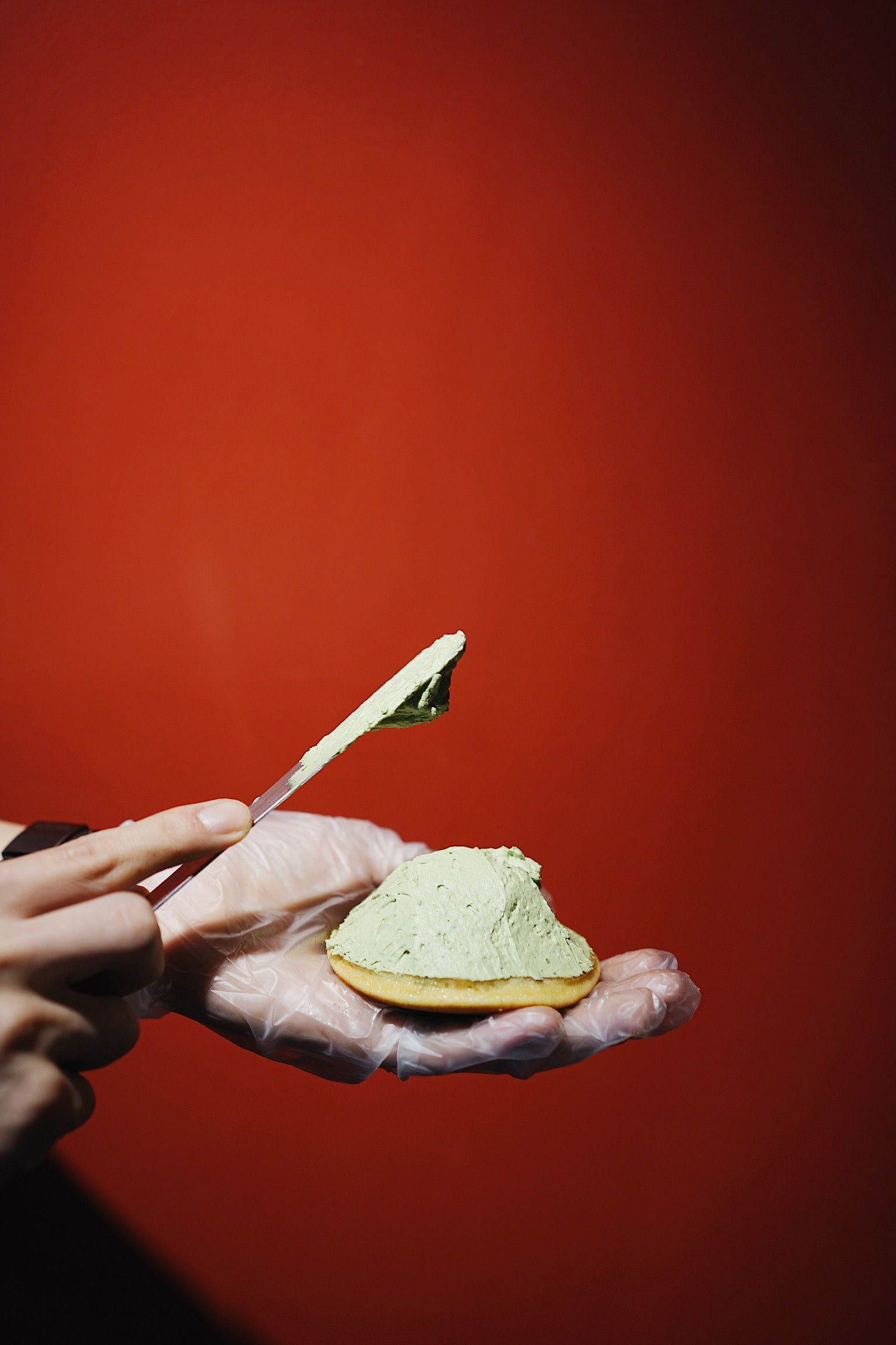
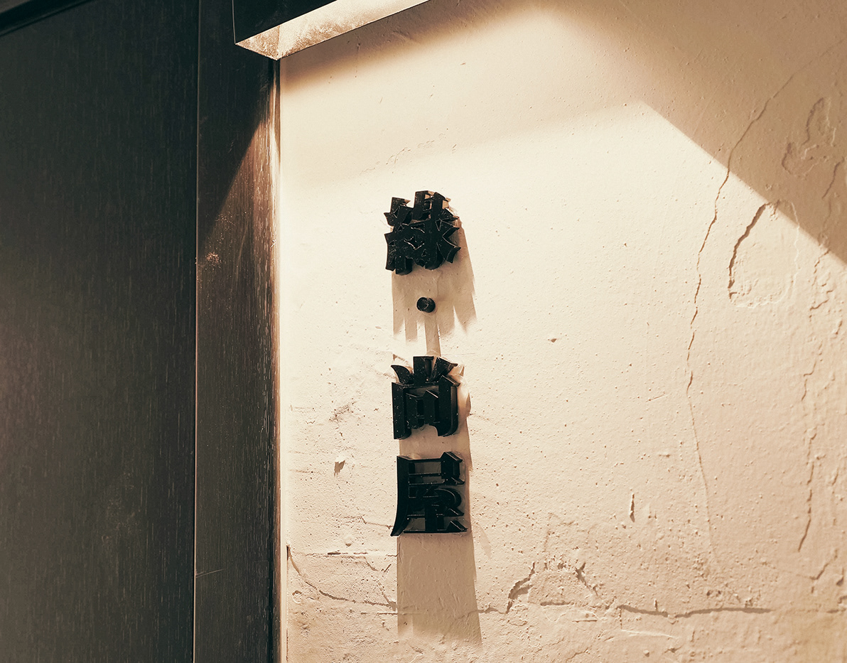
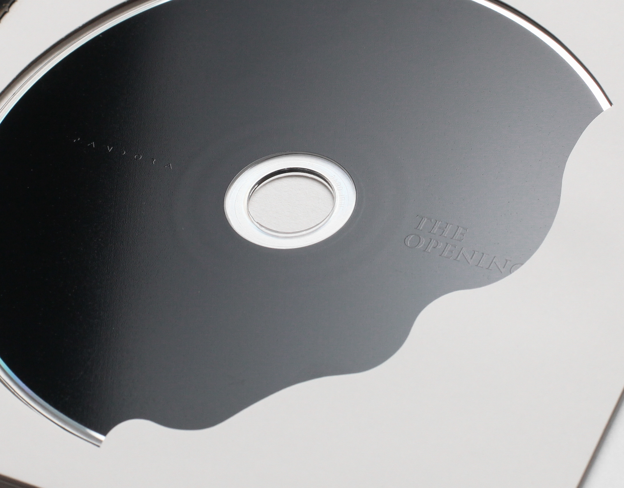
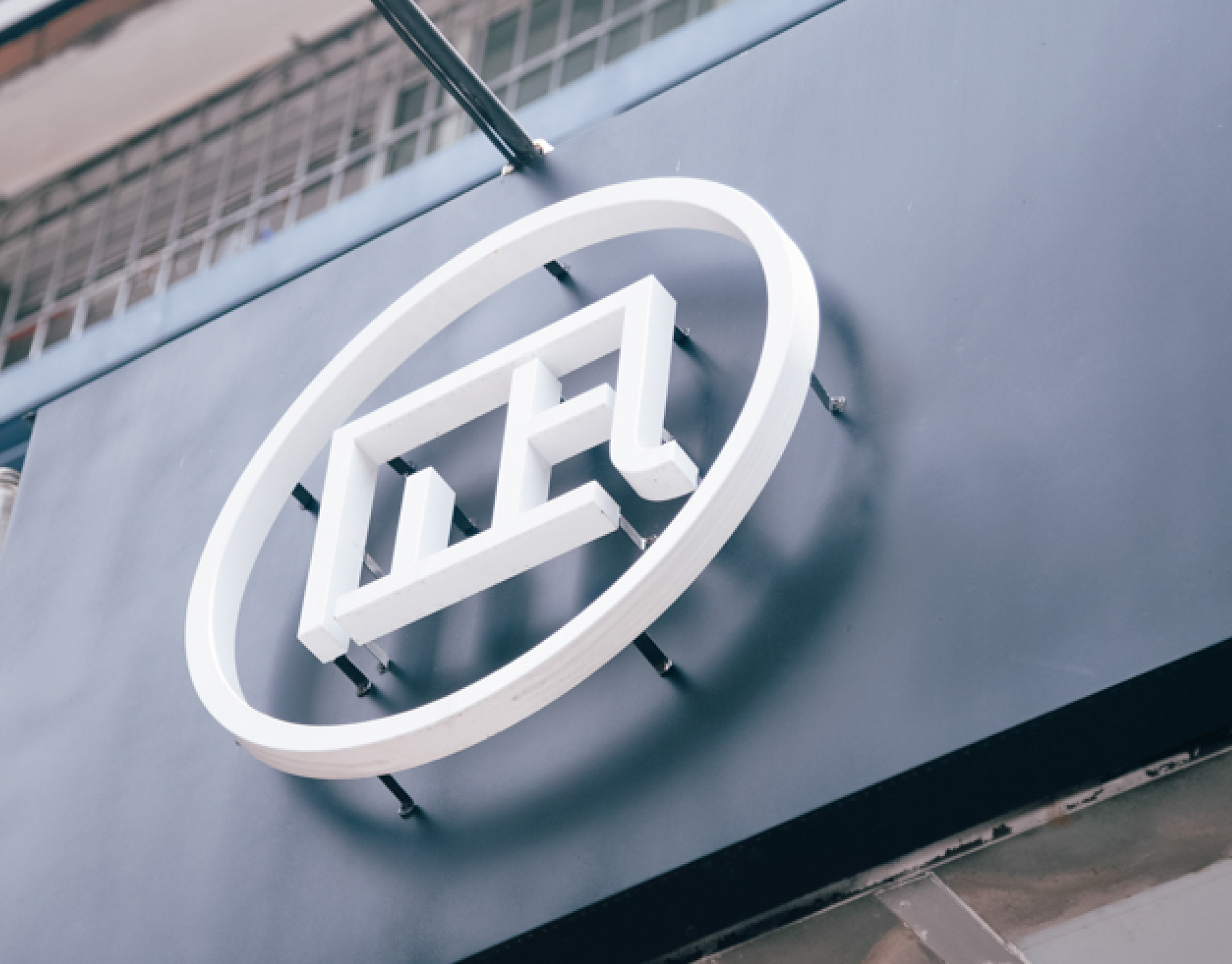
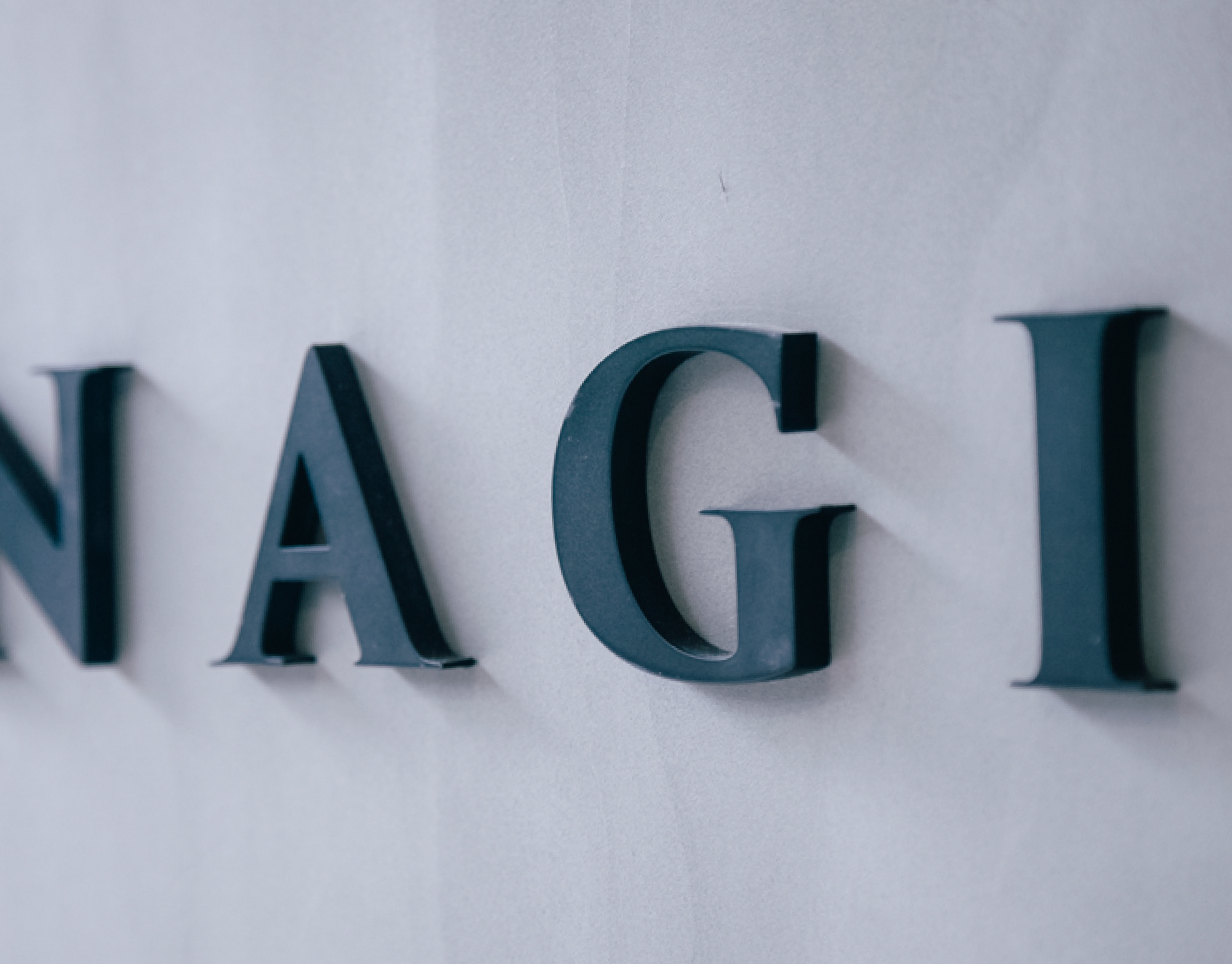
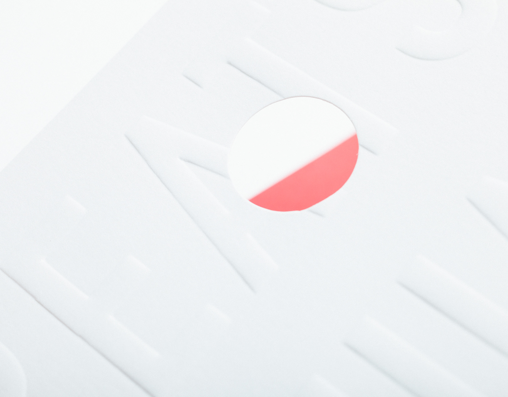
The ower of Sawada Dorayaki learnt from a Japanese master, following the most traditional method of making Dorayaki, a type of Japanese confection. The shop only sells Dorayaki with 3 flavors.We used the Japanese signboard as reference, combine modern geometric composition to make standard words, and add Dorayaki decoration pattern to improve the feeling of retro.We also handled the interior design of the shop, created a mascot, Dorayaki Taro, with 3 designs of postcard.
—
「澤田本家」銅鑼燒專門店
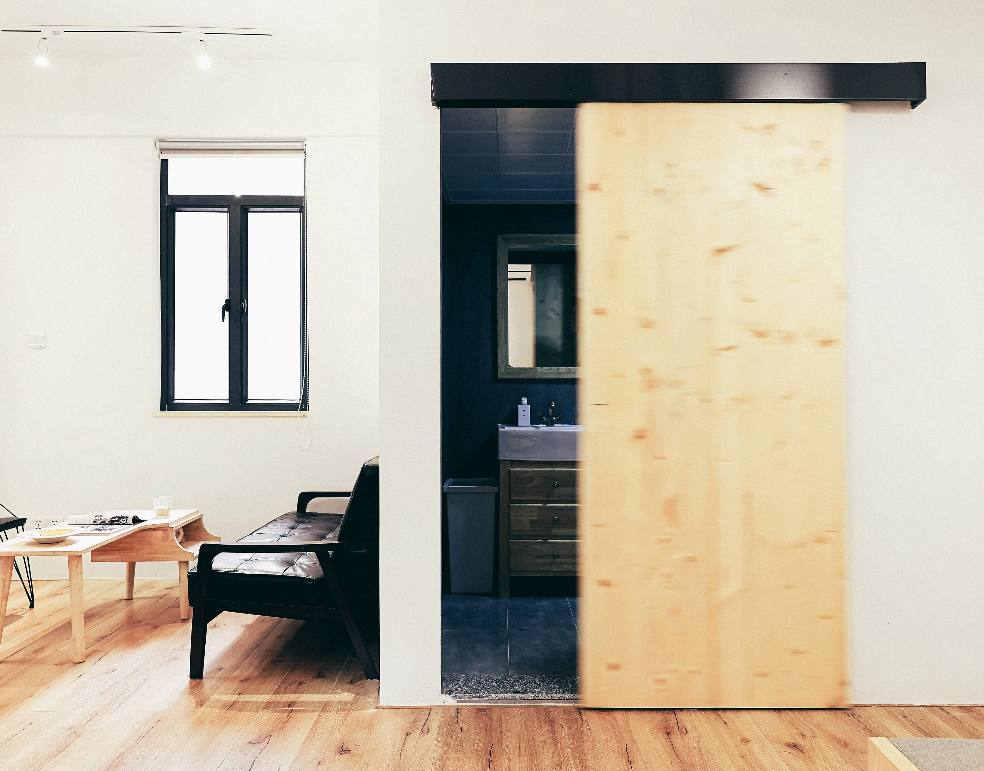
「澤田本家」店主師承日本師傅,沿用最傳統做法製作銅鑼燒。全店只賣銅鑼燒,而且只有三種味道可供選擇。我們以日本傳統招牌為藍本,結合現代幾何構圖製作標準字,并加入銅鑼燒裝飾圖案提高復古感覺。品牌顏色我們選用銅鑼燒蛋皮的黃色和最傳統口味紅豆味的紅色為主色調,運用到VI和室內設計系統等各方面。我們也為品牌創作了吉祥物-銅鑼太郎,并以他為主角設計了三款明信片,提高品牌的好感度。經過開店后的市場反應調查,發現女生和小孩特別喜歡銅鑼太郎,而他們也是品牌的目標客戶群。主店的室內設計我們刻意保留一個開放製作區,讓路過的人可以看到銅鑼燒的製作過程,引起他們的好奇心和食慾。